Population and permutation#
The idea of permutation is fundamental to a wide range of statistical tests.
Permutation allows us to simulate data in many more situations than we have seen thus far.
We build up the tools to use permutation for a test of differences between two groups.
Example: are Brexit voters older?#
Here we analyze the Brexit survey.
As you will see at the link above, the data are from a survey of the UK
population. Each row in the survey corresponds to one person answering. One
of the questions, named brexit_vote is how the person voted in the Brexit
referendum. Another, age, is the age of the person in years.
# Array library.
import numpy as np
# Make random number generator.
rng = np.random.default_rng()

# Data frame library, to load the survey data.
import pandas as pd
pd.set_option('mode.copy_on_write', True)

# Plotting
import matplotlib.pyplot as plt

# Fancy plots
plt.style.use('fivethirtyeight')
If you are running on your laptop, first
download the data file
to the same directory as this notebook.
The version of the survey data we have here, has two bits of information for each respondent. First — whether the respondent claimed to have voted Remain or Leave in the referendum. Second — the respondents’ reported age in years. Here is what that looks like as a Pandas data frame:
# Use Pandas to read the data.
# Don't worry if you aren't confident with Pandas yet - we only
# use Pandas here to get the ages for the Remain and Leave voters.
# Load the data frame, and put it in the variable "brexit_df".
brexit_df = pd.read_csv('brexit_survey.csv')
# Show the first 5 rows.
brexit_df.head()
| brexit_vote | age | |
|---|---|---|
| 0 | Remain | 37 |
| 1 | Remain | 55 |
| 2 | Leave | 71 |
| 3 | Remain | 37 |
| 4 | Remain | 42 |
We are only interested in the reported ages for the Remain voters, and the
reported ages for the Leave voters. The code below extracts the ages for
the Remain voters into one array, called remain_ages, and the ages for the
Leave voters into another array, called leave_ages.
# Extract Remain and Leave voters into their separate own data frames.
# As above, we are just using Pandas here to get arrays for the
# Remain and Leave voter ages.
remainers = brexit_df[brexit_df['brexit_vote'] == 'Remain']
leavers = brexit_df[brexit_df['brexit_vote'] == 'Leave']
# Extract ages into arrays.
remain_ages = np.array(remainers['age'])
leave_ages = np.array(leavers['age'])
There were 774 voters who claimed to have voted “Remain”, and therefore, remain_ages is an array with 774 values:
n_remain = len(remain_ages)
n_remain
774
remain_ages is an array containing the 774 reported ages for the Remain
voters:
# Show the first 10 ages for the Remain voters.
remain_ages[:10]
array([37, 55, 37, 42, 69, 20, 38, 32, 58, 46])
There were 541 Leave voters:
n_leave = len(leave_ages)
n_leave
541
leave_ages is an array containing the 541 reported ages for the Remain
voters:
# Show the first 10 ages for the Leave voters.
leave_ages[:10]
array([71, 60, 74, 61, 47, 56, 76, 35, 44, 38])
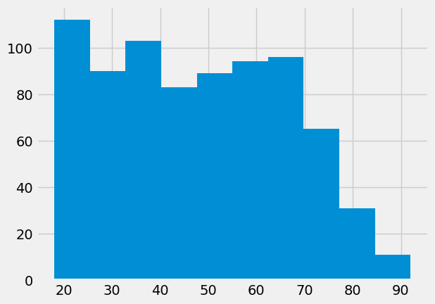
Show the age distributions for the two groups:
plt.hist(remain_ages);
plt.hist(leave_ages);
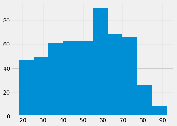
These certainly look like different distributions.
We might summarize the difference, by looking at the difference in means:
leave_mean = np.mean(leave_ages)
leave_mean
51.715341959334566
remain_mean = np.mean(remain_ages)
remain_mean
48.01550387596899
actual_difference = leave_mean - remain_mean
actual_difference
3.6998380833655773
The distributions do look different.
They have a mean difference of nearly 4 years.
Could this be due to sampling error?
If we took two random samples of 774 and 541 voters, from the same population, we would expect to see some difference, just by chance.
By chance means, because random samples vary.
What is the population, in this case?
It is not exactly the whole UK population, because the survey only sampled people who were eligible to vote.
It might not even be the whole UK population, who are eligible to vote. Perhaps the survey company got a not-representative range of ages, for some reason. We are not interested in that question, only the question of whether the Leave and Remain voters could come from the same population, where the population is, people selected by the survey company.
How do we find this population, to do our simulation?
Population by permutation#
Here comes a nice trick. We can use the data that we already have, to simulate the effect of drawing lots of random samples, from the underlying population.
Let us assume that the Leave voters and the Remain voters are in fact samples from the same underlying population.
If that is the case, we can throw the Leave and Remain voters into one big pool of 774 + 541 == 1315 voters.
Then we can take split this new mixed sample into two groups, at random, one with 774 voters, and the other with 541. The new groups have a random mix of the original Leave and Remain voters. Then we calculate the difference in means between these two new, fake groups.
pooled = np.concatenate([remain_ages, leave_ages])
pooled
array([37, 55, 37, ..., 20, 40, 31])
len(pooled)
1315
We mix the two samples together, using rng.permutation, to make a
random permutation of the values. It works like this:
pets = np.array(['cat', 'dog', 'rabbit'])
pets
array(['cat', 'dog', 'rabbit'], dtype='<U6')
rng.permutation(pets)
array(['rabbit', 'dog', 'cat'], dtype='<U6')
rng.permutation(pets)
array(['cat', 'dog', 'rabbit'], dtype='<U6')
Now to mix up ages of the Leavers and Remainers:
shuffled = rng.permutation(pooled)
shuffled
array([58, 23, 19, ..., 23, 78, 38])
We split the newly mixed group into 774 simulated Remain voters and 541 simulated Leave voters, where each group is a random mix of the original Leave and Remain ages.
# The first 774 values
fake_remainers = shuffled[:774]
# The rest
fake_leavers = shuffled[774:]
len(fake_leavers)
541
Now we can calculate the mean difference. This is our first simulation:
fake_difference = np.mean(fake_leavers) - np.mean(fake_remainers)
fake_difference
1.8469911686177838
That looks a lot smaller than the difference we saw. We want to keep doing this, to collect more simulations. We need to mix up the ages again, to give us new random samples of fake Remainers and fake Leavers.
shuffled = rng.permutation(pooled)
fake_difference_2 = np.mean(shuffled[:774]) - np.mean(shuffled[774:])
fake_difference_2
-2.0950842300840122
Now we know how do to this once, we can use the for loop to do the
permutation operation many times. We collect the results in an array. You will
recognize the code in the for loop from the code in the cells above.
# An array of zeros to store the fake differences
example_diffs = np.zeros(10000)
# Do the shuffle / difference steps 10000 times
for i in np.arange(10000):
    shuffled = rng.permutation(pooled)
    fake_remainers = shuffled[:n_remain]
    fake_leavers = shuffled[n_remain:]
    eg_diff = np.mean(fake_leavers) - np.mean(fake_remainers)
    # Collect the results in the results array
    example_diffs[i] = eg_diff
Our results array now has 10000 fake mean differences:
What distribution do these differences have?
plt.hist(example_diffs);
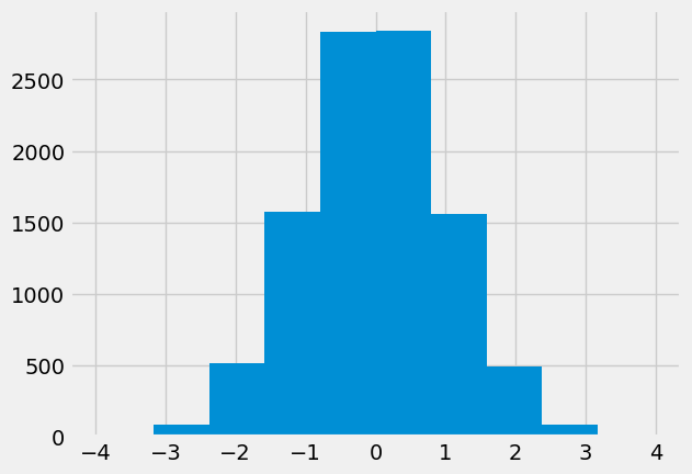
This is called the sampling distribution. In our case, this is the sampling distribution of the difference in means. It is the sampling distribution, because it is the distribution we expect to see, when taking random samples from the same underlying population.
Our question now is, is the difference we actually saw, a likely value, given the sampling distribution. Let’s plot the actual difference, so we can see how similar/different it is to the simulated differences.
# do not worry about the code below, it just plots the sampling distribution, the actual difference in the mean ages,
# and adds some labels to the histogram.
plt.hist(example_diffs, label = 'simulated differences')
fontsize = {'fontsize': 10}
plt.plot(actual_difference, 20 , 'o',
         markersize = 10,color = 'red',
         label = 'actual difference')
plt.xlabel('Difference between the mean ages of leavers and remainers', **fontsize)
plt.ylabel('Number of times obtained in simulation', **fontsize)
plt.legend(**fontsize);
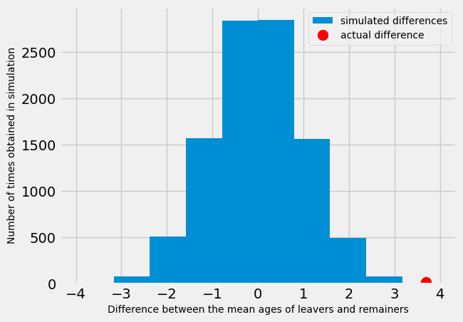
Looking at the distribution above - what do you think?
The blue histogram shows the distribution of differences we would expect to obtain in an ideal world. That is, in a world where there was no difference between the mean age of leavers and remainers. The red dot shows the actual difference between the mean ages of leavers and remainers. Does it look likely that we would obtain the actual difference in the ideal world?
As a first pass, let us check how many of the values from the sampling distribution are as large, or larger than the value we actually saw.
are_as_high = example_diffs >= actual_difference
n_as_high = np.count_nonzero(are_as_high)
n_as_high
2
The number above is the number of values in the sampling distribution that are as high as, or higher than, the value we actually saw. If we divide by 10000, we get the proportion of the sampling distribution that is as high, or higher.
proportion = n_as_high / 10000
proportion
0.0002
We think of this proportion as an estimate of the probability that we would see a value this high, or higher, if these were random samples from the same underlying population. We call this a p value.