Logistic regression#
Show code cell content
import numpy as np
import pandas as pd
# Safe setting for Pandas.  Needs Pandas version >= 1.5.
pd.set_option('mode.copy_on_write', True)
import matplotlib.pyplot as plt
# Make the plots look more fancy.
plt.style.use('fivethirtyeight')
# Optimization function
from scipy.optimize import minimize
By Peter Rush and Matthew Brett, with considerable inspiration from the logistic regression section of Allen Downey’s book Think Stats, second edition.
In this page we will look at another regression technique: logistic regression.
We use logistic regression when we want to predict a binary categorical outcome variable (or column) from one or more predicting variables (or columns).
A binary categorical variable is one where an observation can fall into one of only two categories. We give each observation a label corresponding to their category. Some examples are:
Did a patient die or did they survive through 6 months of treatment? The patient can only be in only one of the categories. In some column of our data table, patients that died might have the label “died”, and those who have survived have the label “survived”.
Did a person experience more than one episode of psychosis in the last 5 years (“yes” or “no”)?
Did a person with a conviction for one offense offend again (“yes” or “no”)?
For this tutorial, we return to the chronic kidney disease dataset.
Each row in this dataset represents one patient.
For each patient, the doctors recorded whether or not the patient had chronic kidney disease. This is a binary categorical variable; you can see the values in the “Class” column. A value of 1 means the patient did have CKD; a value of 0 means they did not. In this case we are labeling the categories with numbers (1 / 0).
Many of the rest of the columns are measurements from blood tests and urine tests.
df = pd.read_csv('ckd_clean.csv')
df.head()
| Age | Blood Pressure | Specific Gravity | Albumin | Sugar | Red Blood Cells | Pus Cell | Pus Cell clumps | Bacteria | Blood Glucose Random | ... | Packed Cell Volume | White Blood Cell Count | Red Blood Cell Count | Hypertension | Diabetes Mellitus | Coronary Artery Disease | Appetite | Pedal Edema | Anemia | Class | |
|---|---|---|---|---|---|---|---|---|---|---|---|---|---|---|---|---|---|---|---|---|---|
| 0 | 48.0 | 70.0 | 1.005 | 4.0 | 0.0 | normal | abnormal | present | notpresent | 117.0 | ... | 32.0 | 6700.0 | 3.9 | yes | no | no | poor | yes | yes | 1 |
| 1 | 53.0 | 90.0 | 1.020 | 2.0 | 0.0 | abnormal | abnormal | present | notpresent | 70.0 | ... | 29.0 | 12100.0 | 3.7 | yes | yes | no | poor | no | yes | 1 |
| 2 | 63.0 | 70.0 | 1.010 | 3.0 | 0.0 | abnormal | abnormal | present | notpresent | 380.0 | ... | 32.0 | 4500.0 | 3.8 | yes | yes | no | poor | yes | no | 1 |
| 3 | 68.0 | 80.0 | 1.010 | 3.0 | 2.0 | normal | abnormal | present | present | 157.0 | ... | 16.0 | 11000.0 | 2.6 | yes | yes | yes | poor | yes | no | 1 |
| 4 | 61.0 | 80.0 | 1.015 | 2.0 | 0.0 | abnormal | abnormal | notpresent | notpresent | 173.0 | ... | 24.0 | 9200.0 | 3.2 | yes | yes | yes | poor | yes | yes | 1 |
5 rows × 25 columns
There are actually a large number of binary categorical variables in this dataset. For example, the “Hypertension” column has labels for the two categories “yes” (the patient had persistently high blood pressure) or “no”.
The categorical variable we are interested in here is “Appetite”. This has the label “good” for patients with good appetite, and “poor” for those with poor appetite. Poor appetite is a symptom of chronic kidney disease. In our case, we wonder whether the extent of kidney damage does a convincing job in predicting whether the patient has a “good” appetite.
As you remember, the CKD dataset has a column “Hemoglobin” that has the
concentration of hemoglobin from a blood sample. Hemoglobin is the molecule
that carries oxygen in the blood; it is the molecule that makes the red blood
cells red. Damaged kidneys produce lower concentrations of the hormone that
stimulates red blood cell production,
erythropoietin, so CKD
patients often have fewer red blood cells, and lower concentrations of
Hemoglobin. We will take lower “Hemoglobin” as a index of kidney damage.
Therefore, we predict that patients with lower “Hemoglobin” values are more
likely to have poor “Appetite” values, and, conversely, patients with higher
“Hemoglobin” values are more likely to have good “Appetite” values.
First we make a new data frame that just has the two columns we are interested in:
hgb_app = df.loc[:, ['Hemoglobin', 'Appetite']]
hgb_app.head()
| Hemoglobin | Appetite | |
|---|---|---|
| 0 | 11.2 | poor |
| 1 | 9.5 | poor |
| 2 | 10.8 | poor |
| 3 | 5.6 | poor |
| 4 | 7.7 | poor |
Dummy Variables#
We will soon find ourselves wanting to do calculations on the values in the “Appetite” column, and we cannot easily do that with the current string values of “good” and “poor”. Our next step is to recode the string values to numbers, ready for our calculations. We use 1 to represent “good” and 0 to represent “poor”. This kind of recoding, where we replace category labels with 1 and 0 values, is often called dummy coding.
# 'replace' replaces the values in the first argument with the corresponding
# values in the second argument.
hgb_app['appetite_dummy'] = hgb_app['Appetite'].replace(
    ['poor', 'good'],
    [0, 1])
hgb_app.head()
/tmp/ipykernel_5590/2926526315.py:3: FutureWarning: Downcasting behavior in `replace` is deprecated and will be removed in a future version. To retain the old behavior, explicitly call `result.infer_objects(copy=False)`. To opt-in to the future behavior, set `pd.set_option('future.no_silent_downcasting', True)`
  hgb_app['appetite_dummy'] = hgb_app['Appetite'].replace(
| Hemoglobin | Appetite | appetite_dummy | |
|---|---|---|---|
| 0 | 11.2 | poor | 0 |
| 1 | 9.5 | poor | 0 |
| 2 | 10.8 | poor | 0 |
| 3 | 5.6 | poor | 0 |
| 4 | 7.7 | poor | 0 |
Note: When you are doing this, be sure to keep track of which label you have coded as 1. Normally this would be the more interesting outcome. In this case, “good” has the code 1. Keep track of the label corresponding to 1, as it will affect the interpretation of the regression coefficients.
Now we have the dummy (1 or 0) variable, let us use a scatter plot to look at the relationship between hemoglobin concentration and whether a patient has a good appetite.
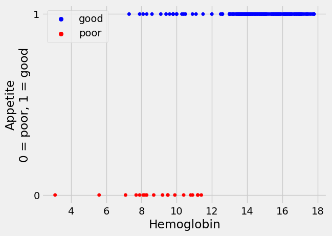
From the plot, it does look as if the patients with lower hemoglobin are more
likely to have poor appetite (appetite_dummy values of 0), whereas patients
with higher hemoglobin tend to have good appetite (appetite_dummy values of
1).
Now we start to get more formal, and develop a model with which we predict the
appetite_dummy values from the Hemoglobin values.
How about linear regression?#
Remember that, in linear regression, we predict scores on the outcome variable (or column) using a straight-line relationship of the predictor variable (or column).
Here are the predictor and outcome variables in our case.
# The x (predictor) and y (outcome) variables.
hemoglobin = hgb_app['Hemoglobin']
appetite_d = hgb_app['appetite_dummy']
Why not use the same linear regression technique for our case? After all, the
appetite_d values are just numbers (0 and 1), as are our hemoglobin values.
Earlier in the textbook, we performed linear regression by using minimize, to
find the value of the slope and intercept of the line which gives the smallest
sum of the squared prediction errors.
Recall that, in linear regression:
predicted and predictor variable here are sequences of values, with one value for each observation (row) in the dataset. In our case we have:
print('Rows in CKD data', len(hgb_app))
Rows in CKD data 158
“observations” (patients), so there will be the same number of scores on the
predictor variable (hemoglobin), and the same number of predictions, in
predicted. By contrast, the slope and intercept are single values, defining
the line.
We used minimize to find the values of the slope and intercept which give the
“best” predictions. So far, we have almost invariably defined the best
values for slope and intercept as the values that give the smallest sum of the
squared prediction errors.
What would happen if we tried to use linear regression to predict the probability of having good appetite, based on hemoglobin concentrations?
Let us start by grabbing a version of the rmse_any_line function from the
Using minimize page.
def rmse_any_line(c_s, x_values, y_values):
    # c_s is a list containing two elements, an intercept and a slope.
    intercept, slope = c_s
    # Values predicted from these x_values, using this intercept and slope.
    predicted = intercept + x_values * slope
    # Difference of prediction from the actual y values.
    error = y_values - predicted
    # Sum of squared error.
    return np.sqrt(np.mean(error ** 2))
The root mean squared prediction error, in linear regression, is our cost
function. When we have a good pair of (intercept, slope) in c_s, our function
is cheap - i.e. the returned value is small. When we have a bad pair in
c_s, our function is expensive - the returned value is large.
If the value from rmse_any_line is large, it means the line we are fitting
does not fit the data well. The purpose of linear regression is to find the
line which leads to the smallest cost. In our case, the cost is the sum of the
squared prediction errors.
Let’s use linear regression on the current example. From looking at our plot above, we start with a guess of -1 for the intercept, and 0.1 for the slope.
# Use minimize to find the least sum of squares solution.
min_lin_reg = minimize(rmse_any_line, [-1, 0.1], args=(hemoglobin, appetite_d))
# Show the results that came back from minimize.
min_lin_reg
  message: Optimization terminated successfully.
  success: True
   status: 0
      fun: 0.2555152342856845
        x: [-7.904e-02  7.005e-02]
      nit: 8
      jac: [ 2.459e-07  3.301e-06]
 hess_inv: [[ 6.253e+00 -4.300e-01]
            [-4.300e-01  3.115e-02]]
     nfev: 33
     njev: 11
OK, so that looks hopeful. Using linear regression with minimize we found that the sum of squared prediction errors was smallest for a line with:
# Unpack the slope and intercept estimates from the results object.
lin_reg_intercept, lin_reg_slope = min_lin_reg.x
# Show them.
print('Best linear regression intercept', lin_reg_intercept)
print('Best linear regression slope', lin_reg_slope)
Best linear regression intercept -0.07904129041192967
Best linear regression slope 0.07004926142319177
The linear regression model we are using here is:
predicted_appetite_d = intercept + slope * hemoglobin
Specifically:
predicted_lin_reg = lin_reg_intercept + lin_reg_slope * hemoglobin
predicted_lin_reg
0      0.705510
1      0.586427
2      0.677491
3      0.313235
4      0.460338
         ...
153    1.020732
154    1.076772
155    1.027737
156    0.915658
157    1.027737
Name: Hemoglobin, Length: 158, dtype: float64
Let’s plot our predictions, alongside the actual data. We plot the predictions from linear regression in orange.
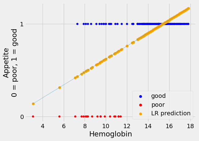
The linear regression line looks plausible, as far as it goes, but it has
several unhappy features for our task of predicting the appetite_d 0 / 1
values.
One thing to like about the line is that the predictions are right to suggest
that the value of appetite_d is more likely to be 1 (meaning “good”) at
higher values of hemoglobin. Also, the prediction line slopes upward as
hemoglobin gets higher, indicating that the probability of good appetite gets
higher as the hemoglobin concentration rises, across patients.
However, when the hemoglobin gets higher than about 15.5, linear regression
starts to predict a value for appetite_d that is greater than 1 - which, of
course, cannot occur in the appetite_d values, which are restricted to 0 or
1.
Looking at the plot, without the regression line, it looks as if we can be fairly confident of predicting a 1 (“good”) value for a hemoglobin above 12.5, but we are increasingly less confident about predicting a 1 value as hemoglobin drops down to about 7.5, at which point we become confident about predicting a 0 value.
These reflections make as wonder whether we should be using something other than a simple, unconstrained straight line for our predictions.
Another prediction line#
Here’s another prediction line we might use for appetite_d, with the
predicted values.
For the moment, please don’t worry about how we came by this line, we will come onto that soon.
The new prediction line is in gold.
Show code cell content
# This is the machinery for making the sigmoid line of the plots below.  We
# will come on that machinery soon.  For now please ignore this code, and
# concentrate on the plots below.

def inv_logit(y):
    """ Reverse logit transformation
    """
    odds_ratios = np.exp(y)  # Reverse the log operation.
    return odds_ratios / (odds_ratios + 1)  # Reverse odds ratios operation.


def params2pps(intercept, slope, x):
    """ Calculate predicted probabilities of 1 for each observation.
    """
    # Predicted log odds of being in class 1.
    predicted_log_odds = intercept + slope * x
    return inv_logit(predicted_log_odds)


# Some plausible values for intercept and slope.
nice_intercept, nice_slope = -7, 0.8
predictions_new = params2pps(nice_intercept, nice_slope, hemoglobin)
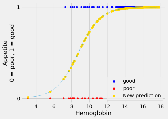
The new not-straight line seems to have much to recommend it. This shape of
line is called “sigmoid”, from the name of the Greek letter “s”. The sigmoid
prediction here never goes above 1 or below 0, so its values are always in the
range of the appetite_d data it is trying to predict. It climbs steeply to a
prediction of 1, and plateaus there, as we get to the threshold of hemoglobin
around 12.5, at which every patient does seem to have “good” appetite
(appetite_d of 1).
We can think of the values from the sigmoid curve as being predicted
probabilities. For example, at a hemoglobin value of 10, the curve gives a
predicted y (appetite_d) value of about 0.73. We can interpret this
prediction as saying that, with a hemoglobin value of 10, there is a
probability of about 0.73 that the corresponding patient will have a “good”
appetite (appetite_d value of 1).
Now let us say that we would prefer to use this kind of sigmoid line to predict
appetite_d. So far, we have only asked minimize to predict directly from a
straight line - for example, in the rmse_any_line function. How can we get
minimize to predict from a family of sigmoid curves, as here? Is there a way
of transforming a sigmoid curve like the one here, with y values from 0 to 1,
to a straight line, where the y values can vary from large negative to large
positive? We would like to do such a conversion, so we have a slope and
intercept that minimize can work with easily.
The answer, you can imagine, is “yes” — we can go from our sigmoid 0 / 1 curve to a straight line with unconstrained y values, in two fairly simple steps. The next sections will cover those steps. The two steps are:
Convert the 0 / 1 probability predictions to 0-to-large positive predictions of the odds ratio. The odds-ratio can vary from 0 to very large positive.
Apply the logarithm function to convert the 0-to-very-large-positive odds-ratio predictions to log odds-ratio predictions, which can vary from very large negative to very large positive.
These two transformations together are called the log-odds or logit transformation. Logistical regression is regression using the logit transform. Applying the logit transform converts the sigmoid curve to a straight line.
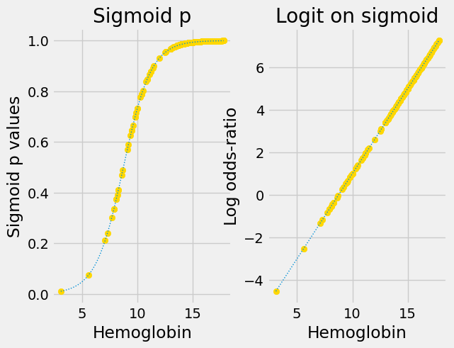
We will explain more about the two stages of the transform below, but for now, here are the two stages in action.
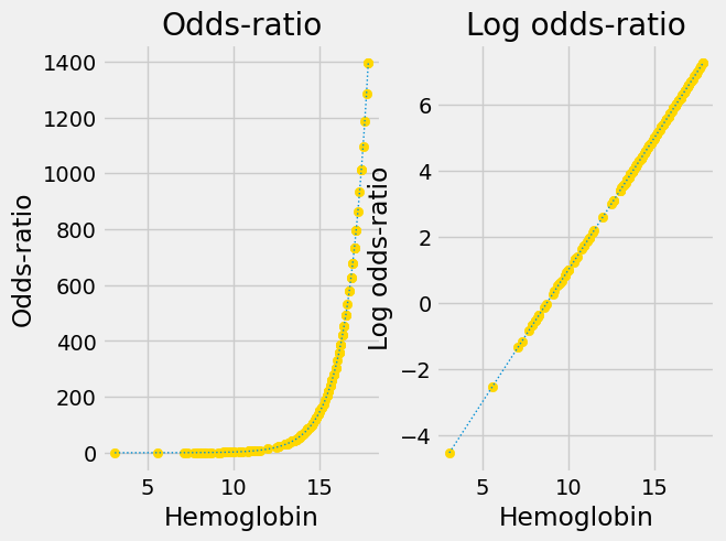
This is the original sigmoid curve above, with the predictions, in its own plot.
Next we apply the conversion from probability to odds-ratio:
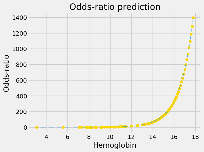
Notice that this is an exponential graph, where the y values increase more and more steeply as the x values increase. We can turn exponential lines like this one into straight lines, using the logarithm function, the next stage of the logit transformation:
predictions_or_log = np.log(predictions_or)
plt.scatter(hemoglobin, predictions_or_log, color='gold')
fine_y_or_log = np.log(fine_y_or)
plt.plot(fine_x, fine_y_or_log, linewidth=1, linestyle=':')
plt.title('Logit prediction')
plt.xlabel('Hemoglobin')
plt.ylabel('Log odds-ratio');
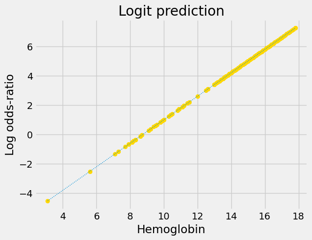
Now we have a straight line, with an intercept and slope, suitable for
minimize. The next few sections go into more detail on the odds-ratio and
logarithm steps.
Probability and Odds#
For logistic regression, in contrast to linear regression, we are interested in predicting the probability of an observation falling into a particular outcome class (0 or 1).
In this case, we are interested in the probability of a patient having “good” appetite, predicted from the patient’s hemoglobin.
We can think of probability as the proportion of times we expect to see a particular outcome.
For example, there are 139 patients with “good” appetite in this data frame,
and 158 patients in total. If you were to repeatedly draw a single patient at
random from the data frame, and record their Appetite, then we expect the proportion of “good” values in the long run, to be 139 / 158 — about 0.88. That is the same as saying there is a probability of 0.88 of a randomly-drawn patient of having a “good” appetite.
Because the patient’s appetite can only be “good” or “poor”, and because the probabilities of all possible options have to add up to 1, the probability of the patient having a “poor” appetite is 1 - 0.88 — about 0.12.
So, the probability can express the proportion of times we expect to see some
event of interest - in our case, the event of interest is “good” in the
Appetite column.
We can think of this same information as an odds ratio.
We often express probabilities as odds ratios. For example, we might say that the odds are 5 to 1 that it will rain today. We mean that it is five times more likely that it will rain today than that it will not rain today. On another day we could estimate that the odds are 0.5 to 1 that it will rain today, meaning that it is twice as likely not to rain, as it is to rain.
The odds ratio is the number of times we expect to see the event of interest (e.g. rain) for every time we expect to see the event of no interest (not rain).
This is just a way of saying a probability in a different way, and we can convert easily between probabilities and odds ratios.
To convert from a probability to an odds ratio, we remember that the odds ratio is the number of times we expect to see the event of interest for every time we expect to see the event of no interest. This is the probability (proportion) for the event of interest, divided by the probability (proportion) of the event of no interest. Say the probability p is some value (it could be any value):
# Our proportion of interest.
p = 0.88
Then the equivalent odds ratio odds_ratio is:
# Odds ratio is proportion of interest, divided by proportion of no interest.
odds_ratio = p / (1 - p)
odds_ratio
7.333333333333334
Notice the odds ratio is greater than one, because p was greater than 0.5. An
odds ratio of greater than one means the event of interest is more likely to
happen than the alternative. An odds ratio of less than one means p was less
than 0.5, and the event of interest is less likely to happen than the
alternative. A p value of 0 gives an odds ratio of 0. As the p value gets close to 1, the odds ratio gets very large.
p = 0.999999
p / (1 - p)
999998.9999712444
We can also convert from odds ratios to p values. Remember the odds ratio is
the number of times we expect to see the event of interest, divided by the
number of times we expect to see the event of no interest. The probability is
the proportion of all events that are events of interest. We can read an
odds_ratio of - say - 2.5 as “the chances are 2.5 to 1”. To get the
probability we divide the number of times we expect to see the event of
interest - here 2.5 - by the number of events in total. The number of events
in total is just the number of events of interest - here 2.5 - plus the number
of events of no interest - here 1. So:
p_from_odds_ratio = odds_ratio / (odds_ratio + 1)
p_from_odds_ratio
0.88
Summary - convert probabilities to odds ratios with:
odds_ratio = p / (1 - p)
Convert odds ratios to probabilities with:
p = odds_ratio / (odds_ratio + 1)
As you’ve seen, when we apply the conversion above, to convert the probability values to odds ratios for our appetite predictions, we get the following:
Notice that the odds ratios we found vary from very close to 0 (for p value predictions very close to 0) to very large (for p values very close to 1).
Notice too that our graph looks exponential, and we want it to be a straight line. Our next step is to apply a logarithm transformation.
The logarithm transform#
See the logarithm refresher page for more background on logarithms.
For now, the only thing you need to know about logarithms is that they are transformations that convert an exponential curve into a straight line.
Here’s an example:
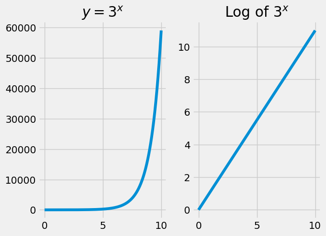
You have already see logs in action transforming the odds-ratio predictions.
The logit transform and its inverse#
The logit transformation from the sigmoid curve to the straight line consists of two steps:
Convert probability to odd-ratios.
Take the log of the result.
The full logit transformation is therefore:
def logit(p):
    """ Apply logit transformation to array of probabilities `p`
    """
    odds_ratios = p / (1 - p)
    return np.log(odds_ratios)
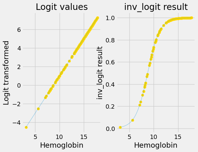
Here are the original sigmoid predictions and the predictions with the logit transform applied:
We also want to be able to go backwards, from the straight-line predictions, to the sigmoid predictions.
np.exp reverses (inverts) the np.log transformation (see the logarithm
refresher page):
# np.exp reverses the effect of np.log.
some_values = np.array([1, 0.5, 3, 6, 0.1])
values_back = np.exp(np.log(some_values))
values_back
array([1. , 0.5, 3. , 6. , 0.1])
You have seen above that there is a simple formula to go from odds ratios to probabilities. The transformation that reverses (inverts) the logit transform is therefore:
def inv_logit(v):
    """ Reverse logit transformation on array `v`
    """
    odds_ratios = np.exp(v)  # Reverse the log operation.
    return odds_ratios / (odds_ratios + 1)  # Reverse odds ratios operation.
inv_logit takes points on a straight line, and converts them to points on a
sigmoid.
First we convince ourselves that inv_logit does indeed reverse the logit
transform:
some_p_values = np.array([0.01, 0.05, 0.1, 0.5, 0.9, 0.95, 0.99])
some_log_odds = logit(some_p_values)
back_again = inv_logit(some_log_odds)
print('Logit, then inv_logit returns the original data', back_again)
Logit, then inv_logit returns the original data [0.01 0.05 0.1 0.5 0.9 0.95 0.99]
The plot above has the sigmoid curve p-value predictions, and the p-value predictions with the logit transformation applied.
Next you see the logit-transformed results on the left. The right shows the
results of applying inv_logit to recover the original p values.
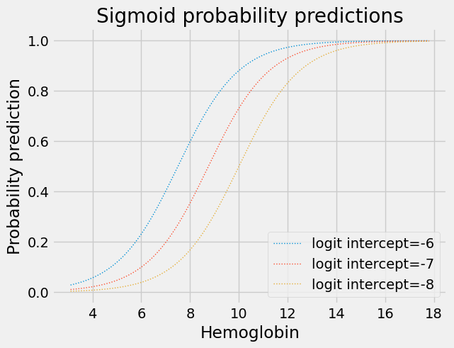
Effect of the Logit slope and intercept on the sigmoid#
Changing the intercept of the logit (log-odds) straight line moves the corresponding inverse logit sigmoid curve left and right on the horizontal axis:
for intercept in [-6, -7, -8]:
    plt.plot(fine_x,
            params2pps(intercept, 0.8, fine_x),
            linewidth=1,
            linestyle=':',
            label='logit intercept=%d' % intercept)
plt.title('Sigmoid probability predictions')
plt.xlabel('Hemoglobin')
plt.ylabel('Probability prediction')
plt.legend();
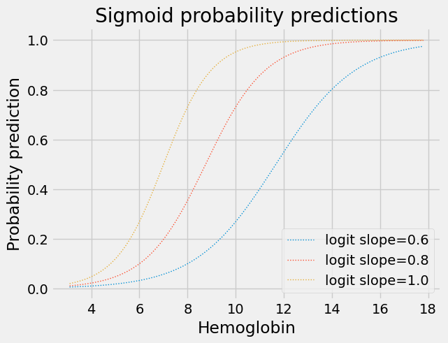
Changing the slope of the logit straight line makes the transition from 0 to 1 flatter or steeper:
for slope in [0.6, 0.8, 1.0]:
    plt.plot(fine_x,
            params2pps(-7, slope, fine_x),
            linewidth=1,
            linestyle=':',
            label='logit slope=%.1f' % slope)
plt.title('Sigmoid probability predictions')
plt.xlabel('Hemoglobin')
plt.ylabel('Probability prediction')
plt.legend();
A first-pass at logistic regression#
You may now see how we could use minimize with a slope and intercept.
Remember that minimize needs a cost function that takes some parameters -
in our case, the intercept and slope — and returns a score, or cost for the
parameters.
In the rmse_any_line cost function above, the score it returns is just the sum
of squared prediction errors from the line. But the cost function can do
anything it likes to generate a score from the line.
In our case, we’re going to make a cost function that takes the intercept and
slope, and generates predictions using the intercept and slope and hemoglobin
values. But these predictions are for the log-odds transformed values, on the
straight line. So the cost function then converts the predictions into p value
predictions, on the corresponding sigmoid, and compares these predictions to the 0 / 1 values in appetite_d.
For example, let’s say we want to get a score for the intercept -7 and the slope 0.8.
First we get the straight-line predictions in the usual way:
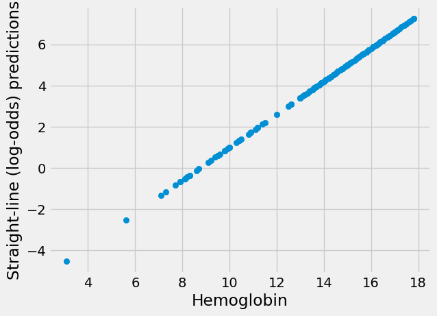
intercept, slope = -7, 0.8
sl_predictions = intercept + slope * hemoglobin

plt.scatter(hemoglobin, sl_predictions)
plt.xlabel('Hemoglobin')
plt.ylabel('Straight-line (log-odds) predictions');
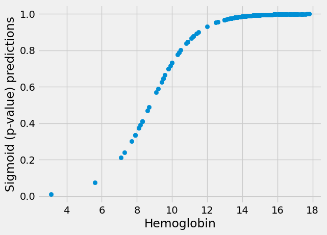
These are predictions on the straight line, but we now need to transform them
to p value (0 to 1) predictions on the sigmoid. We use inv_logit:
sigmoid_predictions = inv_logit(sl_predictions)

plt.scatter(hemoglobin, sigmoid_predictions)
plt.xlabel('Hemoglobin')
plt.ylabel('Sigmoid (p-value) predictions');
Finally, we want to compare the predictions to the actual data to get a score. One way we could do this is our good old root mean squared difference between the sigmoid p-value predictions and the 0 / 1 values:
sigmoid_error = appetite_d - sigmoid_predictions
sigmoid_score = np.sqrt(np.mean(sigmoid_error ** 2))
sigmoid_score
0.25213836312988475
Next we make the cost function that minimize will use. It must accept an array of parameters (an intercept and slope), and calculate the root mean squared error, using the predicted p-values:
def rmse_logit(c_s, x_values, y_values):
    # Unpack intercept and slope into values.
    intercept, slope = c_s
    # Predicted values for log-odds straight line.
    predicted_log_odds = intercept + slope * x_values
    # Predicted p values on sigmoid.
    pps = inv_logit(predicted_log_odds)
    # Prediction errors.
    sigmoid_error = y_values - pps
    # Root mean squared error
    return np.sqrt(np.mean(sigmoid_error ** 2))
We check our function gives the same results as the step-by-step calculation above.
rmse_logit([-7, 0.8], hemoglobin, appetite_d)
0.25213836312988475
Notice what is happening here. The cost function gets the new intercept and slope to try, makes the predictions from the intercept and slope, converts the predictions to probabilities on the sigmoid, and tests those against the real labels.
Now let’s see the cost function in action:
min_res_logit = minimize(rmse_logit, [-7, 0.8], args=(hemoglobin, appetite_d))
min_res_logit
  message: Optimization terminated successfully.
  success: True
   status: 0
      fun: 0.24677033002934054
        x: [-5.281e+00  5.849e-01]
      nit: 14
      jac: [ 5.774e-08  7.190e-07]
 hess_inv: [[ 4.814e+02 -4.559e+01]
            [-4.559e+01  4.516e+00]]
     nfev: 51
     njev: 17
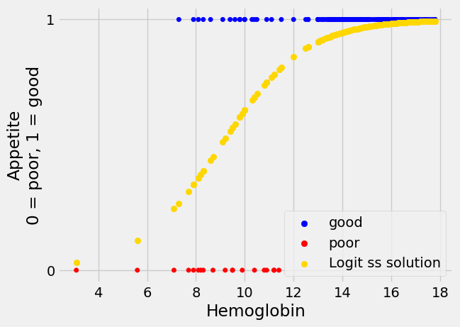
Does this result look like it gives more convincing sigmoid predictions than our guessed intercept an slope of -7 and 0.8?
First get the sigmoid predictions from this line:
logit_rmse_inter, logit_rmse_slope = min_res_logit.x
# Predicted values on log-odds straight line.
predicted_log_odds = logit_rmse_inter + logit_rmse_slope * hemoglobin
# Predicted p values on sigmoid.
logit_rmse_pps = inv_logit(predicted_log_odds)
Then plot:
A different measure of prediction error#
Our sigmoid prediction from sum of squares above looks convincing enough, but, is there a better way of scoring the predictions from our line, than sum of squares?
It turns out there is another quite different and useful way to score the predictions, called likelihood. For reasons we discuss in this page, all standard implementations of logistic regression that we know of, use the likelihood measure that we describe below, instead of the sum of squares measure you see above.
Likelihood asks the question: assuming our predicting line, how likely are the sequence of actual 0 / 1 values that we see?
To answer this question, we first ask this question about the individual 0 / 1 values.
We start with our intercept of -7 and slope of 0.8 for the straight-line log-odds values. We generate the straight-line predictions, then convert them to sigmoid p-value predictions.
log_odds_predictions = -7 + hemoglobin * 0.8
sigmoid_p_predictions = inv_logit(log_odds_predictions)
Remember, these are the predicted probabilities of a 1 label. We rename to remind ourselves:
pp_of_1 = sigmoid_p_predictions
We put these predictions into a copy of our data set to make them easier to display:
hgb_predicted = hgb_app
hgb_predicted['pp_of_1'] = pp_of_1
hgb_predicted.head()
| Hemoglobin | Appetite | appetite_dummy | pp_of_1 | |
|---|---|---|---|---|
| 0 | 11.2 | poor | 0 | 0.876533 |
| 1 | 9.5 | poor | 0 | 0.645656 |
| 2 | 10.8 | poor | 0 | 0.837535 |
| 3 | 5.6 | poor | 0 | 0.074468 |
| 4 | 7.7 | poor | 0 | 0.301535 |
Consider the last row in this data frame:
last_row = hgb_predicted.tail(1)
last_row
| Hemoglobin | Appetite | appetite_dummy | pp_of_1 | |
|---|---|---|---|---|
| 157 | 15.8 | good | 1 | 0.99646 |
The pp_of_1 value is the probability that we will see a label of 1 for this
observation. The outcome was, in fact, 1. Therefore the predicted
probability that we will see the actual value is just the corresponding
pp_of_1 value:
pp_of_last_value = pp_of_1.iloc[-1]
pp_of_last_value
0.9964597097790535
Now consider the first row:
first_row = hgb_predicted.head(1)
first_row
| Hemoglobin | Appetite | appetite_dummy | pp_of_1 | |
|---|---|---|---|---|
| 0 | 11.2 | poor | 0 | 0.876533 |
The probability for an appetite_dummy value of 1 is:
pp_of_1[0]
0.876532952434776
Because the values can only be 0 or 1, the predicted probability of an
appetite_dummy of 0 must be 1 minus the (predicted probability of 1):
pp_of_first_value = 1 - pp_of_1[0]
pp_of_first_value
0.12346704756522398
We can therefore calculate the predicted probability of each 0 / 1 label in the data frame like this:
# Predicted probability of 0.
pp_of_0 = 1 - pp_of_1
# The next line sets all the label == 1 values correctly, but
# the label == 0 values are now incorrect.
pp_of_label = pp_of_1
# Set the label == 0 values correctly.
poor_appetite = appetite_d == 0
pp_of_label[poor_appetite] = pp_of_0[poor_appetite]
# Put this into the data frame for display
hgb_predicted['pp_of_label'] = pp_of_label
hgb_predicted
| Hemoglobin | Appetite | appetite_dummy | pp_of_1 | pp_of_label | |
|---|---|---|---|---|---|
| 0 | 11.2 | poor | 0 | 0.876533 | 0.123467 |
| 1 | 9.5 | poor | 0 | 0.645656 | 0.354344 |
| 2 | 10.8 | poor | 0 | 0.837535 | 0.162465 |
| 3 | 5.6 | poor | 0 | 0.074468 | 0.925532 |
| 4 | 7.7 | poor | 0 | 0.301535 | 0.698465 |
| ... | ... | ... | ... | ... | ... |
| 153 | 15.7 | good | 1 | 0.996166 | 0.996166 |
| 154 | 16.5 | good | 1 | 0.997975 | 0.997975 |
| 155 | 15.8 | good | 1 | 0.996460 | 0.996460 |
| 156 | 14.2 | good | 1 | 0.987383 | 0.987383 |
| 157 | 15.8 | good | 1 | 0.996460 | 0.996460 |
158 rows × 5 columns
There’s a fancy short-cut to the several lines above, that relies on the fact
that multiplying by 0 gives 0. We can form the pp_of_label column by first
multiplying the 0 / 1 label column values by the values in pp_of_1. This
correctly sets the pp_of_label values for labels of 1, and leaves the
remainder as 0. Then we reverse the 0 / 1 labels by subtracting from 1, and
multiply by pp_of_0 to set the 0 values to their correct values. Adding
these two results gives us the correct set of values for both 1 and 0 labels.
# Set label == 1 values to predicted p, others to 0
pos_ps = appetite_d * pp_of_1
# Set label == 0 values to 1-predicted p, others to 0
neg_ps = (1 - appetite_d) * pp_of_0
# Combine by adding.
final = pos_ps + neg_ps
# This gives the same result as the code cell above:
hgb_predicted['pp_of_label_fancy'] = final
hgb_predicted
| Hemoglobin | Appetite | appetite_dummy | pp_of_1 | pp_of_label | pp_of_label_fancy | |
|---|---|---|---|---|---|---|
| 0 | 11.2 | poor | 0 | 0.876533 | 0.123467 | 0.123467 |
| 1 | 9.5 | poor | 0 | 0.645656 | 0.354344 | 0.354344 |
| 2 | 10.8 | poor | 0 | 0.837535 | 0.162465 | 0.162465 |
| 3 | 5.6 | poor | 0 | 0.074468 | 0.925532 | 0.925532 |
| 4 | 7.7 | poor | 0 | 0.301535 | 0.698465 | 0.698465 |
| ... | ... | ... | ... | ... | ... | ... |
| 153 | 15.7 | good | 1 | 0.996166 | 0.996166 | 0.996166 |
| 154 | 16.5 | good | 1 | 0.997975 | 0.997975 | 0.997975 |
| 155 | 15.8 | good | 1 | 0.996460 | 0.996460 | 0.996460 |
| 156 | 14.2 | good | 1 | 0.987383 | 0.987383 | 0.987383 |
| 157 | 15.8 | good | 1 | 0.996460 | 0.996460 | 0.996460 |
158 rows × 6 columns
We can do the whole cell above in one line:
# Compact version of pp of label calculation.
final_again = appetite_d * pp_of_1 + (1 - appetite_d) * (1 - pp_of_1)
hgb_predicted['pp_again'] = final_again
hgb_predicted
| Hemoglobin | Appetite | appetite_dummy | pp_of_1 | pp_of_label | pp_of_label_fancy | pp_again | |
|---|---|---|---|---|---|---|---|
| 0 | 11.2 | poor | 0 | 0.876533 | 0.123467 | 0.123467 | 0.876533 |
| 1 | 9.5 | poor | 0 | 0.645656 | 0.354344 | 0.354344 | 0.645656 |
| 2 | 10.8 | poor | 0 | 0.837535 | 0.162465 | 0.162465 | 0.837535 |
| 3 | 5.6 | poor | 0 | 0.074468 | 0.925532 | 0.925532 | 0.074468 |
| 4 | 7.7 | poor | 0 | 0.301535 | 0.698465 | 0.698465 | 0.301535 |
| ... | ... | ... | ... | ... | ... | ... | ... |
| 153 | 15.7 | good | 1 | 0.996166 | 0.996166 | 0.996166 | 0.996166 |
| 154 | 16.5 | good | 1 | 0.997975 | 0.997975 | 0.997975 | 0.997975 |
| 155 | 15.8 | good | 1 | 0.996460 | 0.996460 | 0.996460 | 0.996460 |
| 156 | 14.2 | good | 1 | 0.987383 | 0.987383 | 0.987383 | 0.987383 |
| 157 | 15.8 | good | 1 | 0.996460 | 0.996460 | 0.996460 | 0.996460 |
158 rows × 7 columns
When the pp_of_label values are near 1, this means the result was close to
the prediction. When they are near 0, it means the result was unlike the
prediction.
Now we know the probabilities of each actual 0 and 1 label, we can get a
measure of how likely the combination of all these labels are, given these
predictions. We do this by multiplying all the probabilities in
pp_of_label. When the probabilities in pp_of_label are all fairly near 1,
multiplying them will give a number that is not very small. When some or many
of the probabilities are close to 0, the multiplication will generate a very
small number.
The result of this multiplication is called the likelihood of this set of labels, given the predictions.
If the predictions are closer to the actual values, the likelihood will be larger, and closer to 1. When the predictions are not close, the likelihood will be low, and closer to 0.
Here is the likelihood for our intercept of -7 and slope of 0.8.
# np.prod multiplies each number to give the product of all the numbers.
likelihood = np.prod(pp_of_label)
likelihood
1.463854029404182e-13
This is a very small number. Likelihoods are often close to 0 with a
reasonable number of points, and somewhat inexact prediction, because there
tend to be a reasonable number of small p values in pp_of_labels. The
question is - do other values for the intercept and slope give smaller or
larger values for the likelihood?
We can put this likelihood scoring into our cost function, instead of using scoring with the sum of squares.
One wrinkle is that we want our cost function value to be lower when the
line is a good predictor, but the likelihood is higher when the line is a
good predictor. We solve this simply by sticking a minus on the likelihood
before we return from the cost function. This makes minimize find the
parameters giving the minimum of the negative likelihood, and therefore,
the maximum likelihood (ML).
def simple_ml_logit_cost(intercept_and_slope, x, y):
    """ Simple version of cost function for maximum likelihood
    """
    intercept, slope = intercept_and_slope
    # Make predictions for sigmoid.
    predicted_log_odds = intercept + slope * x
    pp_of_1 = inv_logit(predicted_log_odds)
    # Calculate predicted probabilities of actual labels.
    pp_of_labels = y * pp_of_1 + (1 - y) * (1 - pp_of_1)
    likelihood = np.prod(pp_of_labels)
    # Ask minimize to find maximum by adding minus sign.
    return -likelihood
We can try that cost function, starting at our familiar intercept of -7 and slope of 0.8.
Before we do, there is one extra wrinkle, that we will solve in another way
further down the notebook. At the moment the likelihood values we are
returning are very small - in the order of \(10^{-13}\). We expect scores for
different plausible lines to differ from each other by an even smaller number.
By default, minimize will treat these very small differences as
insignificant. We can tell minimize to pay attention to these tiny
differences by passing a very small value to the tol parameter (tol for
tolerance).
mr_ML = minimize(simple_ml_logit_cost,  # Cost function
                 [-7, 0.8],  # Guessed intercept and slope
                 args=(hemoglobin, appetite_d),  # x and y values
                 tol=1e-16)  # Attend to tiny changes in cost function values.
# Show the result.
mr_ML
  message: Desired error not necessarily achieved due to precision loss.
  success: False
   status: 2
      fun: -2.117164088219709e-13
        x: [-7.003e+00  7.722e-01]
      nit: 6
      jac: [ 2.279e-14 -2.254e-15]
 hess_inv: [[ 4.655e+07  4.707e+08]
            [ 4.707e+08  4.760e+09]]
     nfev: 166
     njev: 52
minimize complains that it was not happy with the numerical accuracy of its
answer, and we will address that soon. For now, let us look at the predictions
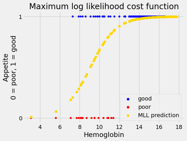
to see if they are reasonable.
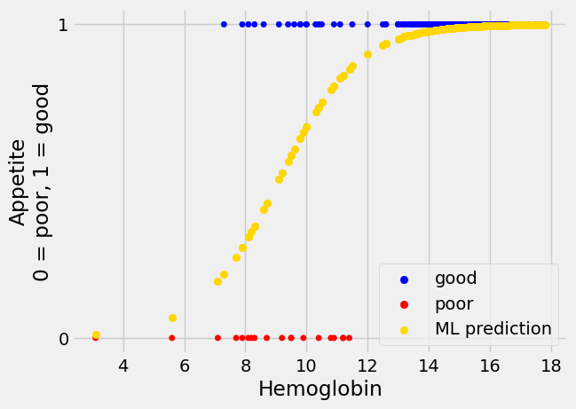
inter_ML, slope_ML = mr_ML.x
predicted_ML = inv_logit(inter_ML + slope_ML * hemoglobin)
A computation trick for the likelihood#
As you have seen, the likelihood values can be, and often are, very small, and close to zero.
You may also know that standard numerical calculations on computers are not completely precise; the calculations are only accurate to around 16 decimal places. This is because of the way computers store floating point numbers. You can find more detail in this page on floating point numbers.
The combination of small likelihood values, and limited calculation precision, can be a problem for the simple ML logistic cost function you see above. As a result, practical implementations of logistic regression use an extra trick to improve the calculation accuracy of the likelihoods.
This trick also involves logarithms.
Here we show a very important property of the logarithm transform:
print('Multiplying two numbers', 11 * 15)
print('Take logs, add logs, unlog', np.exp(np.log(11) + np.log(15)))
Multiplying two numbers 165
Take logs, add logs, unlog 165.00000000000009
What you see here is that we get (almost) the same answer if we:
Multiply two numbers OR
If we take the logs of the two numbers, add them, then reverse the log operation, in this case with
np.exp.
We get almost the same number because of the limitations of the precision of the calculations. For our cases, we do not need to worry about these tiny differences.
The log-add-unlog trick means that we can replace multiplication by addition, if we take the logs of the values.
Here we do the same trick on an array of numbers:
some_numbers = np.array([11, 15, 1, 0.3])
print('Product of the array', np.prod(some_numbers))
print('Log-add-unlog on the array', np.exp(np.sum(np.log(some_numbers))))
Product of the array 49.5
Log-add-unlog on the array 49.500000000000036
We can use this same trick to calculate our likelihood by adding logs instead of multiplying the probabilities directly:
print('Likelihood with product of array', np.prod(pp_of_label))
# The log-add-unlog version.
logs_of_pp = np.log(pp_of_label)
log_likelihood = np.sum(logs_of_pp)
print('Likelihood with log-add-unlog', np.exp(log_likelihood))
Likelihood with product of array 1.463854029404182e-13
Likelihood with log-add-unlog 1.4638540294041883e-13
This doesn’t seem to have solved all our problem, because we still end up with
the type of tiny number that confuses minimize.
The next stage of the solution is to realize that the minimize does not need
the actual likelihood, it needs some number that goes up or down in exactly
the same way as likelihood. If the cost function can return some number that
goes up when likelihood goes up, and goes down when likelihood goes down,
minimize will still find the same parameters to minimize this cost function.
Specifically we want the value that comes back from the cost function to vary monotonically with respect to the likelihood. See the discussion on monotonicity in the Sum of squares, root mean square page.
In our case you may be able to see that the likelihood and log likelihood are monotonic with respect to each other, so if we find the parameters minimizing log likelihood, those parameters will also minimize likelihood.
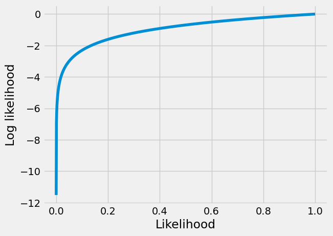
The plot below shows the monotonicity of likelihood and log likelihood. You can see it is true that when the likelihood goes up, then the log of the likelihood will also go up, and vice versa, so the log the likelihood is monotonic with respect to the likelihood, and we can use it instead of the likelihood, in our cost function.
likelihood_values = np.linspace(1e-5, 1, 1000)
plt.plot(likelihood_values, np.log(likelihood_values))
plt.xlabel('Likelihood')
plt.ylabel('Log likelihood');
This means that our cost function does not have to do the last nasty unlog step above, that generates the tiny value for likelihood. We can just return the (minus of the) log of the likelihood. The log of the likelihood turns out to be a manageable negative number, even when the resulting likelihood is tiny.
log_likelihood
-29.552533505045645
This trick gives us a much more tractable number to return from the cost function, because the log likelihood is much less affected by errors from lack of precision in the calculation.
def mll_logit_cost(intercept_and_slope, x, y):
    """ Cost function for maximum log likelihood

    Return minus of the log of the likelihood.
    """
    intercept, slope = intercept_and_slope
    # Make predictions for sigmoid.
    predicted_log_odds = intercept + slope * x
    pp_of_1 = inv_logit(predicted_log_odds)
    # Calculate predicted probabilities of actual labels.
    pp_of_labels = y * pp_of_1 + (1 - y) * (1 - pp_of_1)
    # Use logs to calculate log of the likelihood
    log_likelihood = np.sum(np.log(pp_of_labels))
    # Ask minimize to find maximum by adding minus sign.
    return -log_likelihood
Use the new cost function:
mr_MLL = minimize(mll_logit_cost,  # Cost function
                  [-7, 0.8],  # Guessed intercept and slope
                  args=(hemoglobin, appetite_d),  # x and y values
                  )
# Show the result.
mr_MLL
  message: Optimization terminated successfully.
  success: True
   status: 0
      fun: 29.16799389585748
        x: [-7.292e+00  7.992e-01]
      nit: 7
      jac: [ 7.153e-07  0.000e+00]
 hess_inv: [[ 2.747e+00 -2.571e-01]
            [-2.571e-01  2.509e-02]]
     nfev: 27
     njev: 9
Notice that we did not have to tell minimize to use a very small value for
the tolerance this time.
The values that come back are very similar to our previous, more fragile version that used the likelihood:
inter_MLL, slope_MLL = mr_MLL.x
predicted_MLL = inv_logit(inter_MLL + slope_MLL * hemoglobin)
You have just seen the standard calculations behind most packages that implement logistic regression.
To show this is standard, let us do the same regression in Statsmodels
Logistic Regression with Statsmodes#
As with linear regression, we can easily perform logistic regression using Statsmodels.
# Get the formula interface for Statsmodels
import statsmodels.formula.api as smf
# Create the model.
log_reg_mod = smf.logit('appetite_dummy ~ Hemoglobin', data=hgb_app)
# Fit it.
fitted_log_reg_mod = log_reg_mod.fit()
fitted_log_reg_mod.summary()
Optimization terminated successfully.
         Current function value: 0.184608
         Iterations 8
| Dep. Variable: | appetite_dummy | No. Observations: | 158 |
|---|---|---|---|
| Model: | Logit | Df Residuals: | 156 |
| Method: | MLE | Df Model: | 1 |
| Date: | Wed, 05 Jun 2024 | Pseudo R-squ.: | 0.4976 |
| Time: | 16:10:57 | Log-Likelihood: | -29.168 |
| converged: | True | LL-Null: | -58.054 |
| Covariance Type: | nonrobust | LLR p-value: | 2.944e-14 |
| coef | std err | z | P>|z| | [0.025 | 0.975] | |
|---|---|---|---|---|---|---|
| Intercept | -7.2919 | 1.659 | -4.396 | 0.000 | -10.543 | -4.041 |
| Hemoglobin | 0.7992 | 0.158 | 5.042 | 0.000 | 0.489 | 1.110 |
Notice that Statsmodels lists the “Model” as “Logit” and the “Method” as “MLE” — Maximum Likelihood Estimation.
Look at the table above under ‘coef’. Compare the logistic regression intercept
and slope that Statsmodels found to the ones we got from minimize and the
maximum log likelihood (MLL) cost function.
print('Intercept from minimize =', inter_MLL)
print('Slope from minimize =', slope_MLL)
Intercept from minimize = -7.291872373805338
Slope from minimize = 0.7991543932832907
Finally, we can use the predict method of Statsmodels to generate predicted
probabilities from the logistic regression model we have just fitted:
sm_predictions = fitted_log_reg_mod.predict(hgb_app['Hemoglobin'])
sm_predictions.head()
0    0.840058
1    0.574466
2    0.792325
3    0.056433
4    0.242617
dtype: float64
Let us plot the predicted probabilities of having “good” appetite, from Statsmodels:
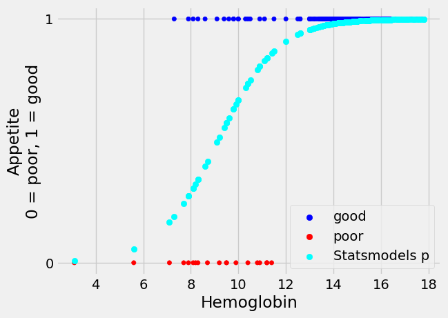
We can see graphically that these predictions look identical to the ones we obtained from minimize.
Let us see what the largest absolute difference between the predictions from the two methods is:
np.max(np.abs(predicted_MLL - sm_predictions))
1.2126886475560816e-07
That is very close to 0. The models are making almost identical predictions.
Summary#
This tutorial has shown you how to do binary logistic regression with one numerical predictor variable.
Exercises for reflection#
You might want to read the logarithm refresher page for these questions.
Consider the expression
np.exp(y)in theinv_logitexpression above. This means “raisenp.eto the power of the values iny”, and could equally well be written asnp.e ** y(it would give exactly the same result). Now consider changingnp.exp(y)to10 ** y. Now we are working in base 10 instead of basenp.e. What would happen to:The best-fit p values predictions returned via
minimize?The slope and intercept of the best-fit log-odds straight line?
Reflect, using the reasoning here, then try it and see.
Consider the expression
np.sum(np.log(pp_of_labels))in themll_logit_costcost function. This is usingnp.log, which is log to the basenp.e. Consider what would happen if you change this expression tonp.sum(np.log10(pp_of_labels))(log to the base 10). What would happen to:The best-fit p values predictions returned via
minimize?The slope and intercept of the best-fit log-odds straight line?
Reflect, using the reasoning here, then try it and see.