The mean and slopes#
In The Mean as Predictor, we found that the mean had some good properties as a single best predictor for a whole distribution.
The mean gives a total prediction error of zero. Put otherwise, on average, your prediction error is zero.
The mean gives the lowest squared error. Put otherwise, the mean gives the lowest average squared difference from the observed value.
Now we can consider what predictor we should use when predicting one set of values, from a different set of values.
We load our usual libraries.
import numpy as np
import matplotlib.pyplot as plt
# Make plots look a little bit more fancy
plt.style.use('fivethirtyeight')
# Print to 4 decimal places, show tiny values as 0
np.set_printoptions(precision=4, suppress=True)
import pandas as pd
pd.set_option('mode.copy_on_write', True)
We start with some data on chronic kidney disease.
Download the data to your computer via this link:
ckd_clean.csv.
This is a data table with one row per patient and one column per test on that patient. Many of columns are values from blood tests. Most of the patients have chronic kidney disease.
To make things a bit easier this dataset is a version from which we have already dropped all missing values. See the dataset page linked above for more detail.
# Run this cell
ckd = pd.read_csv('ckd_clean.csv')
ckd.head()
| Age | Blood Pressure | Specific Gravity | Albumin | Sugar | Red Blood Cells | Pus Cell | Pus Cell clumps | Bacteria | Blood Glucose Random | ... | Packed Cell Volume | White Blood Cell Count | Red Blood Cell Count | Hypertension | Diabetes Mellitus | Coronary Artery Disease | Appetite | Pedal Edema | Anemia | Class | |
|---|---|---|---|---|---|---|---|---|---|---|---|---|---|---|---|---|---|---|---|---|---|
| 0 | 48.0 | 70.0 | 1.005 | 4.0 | 0.0 | normal | abnormal | present | notpresent | 117.0 | ... | 32.0 | 6700.0 | 3.9 | yes | no | no | poor | yes | yes | 1 |
| 1 | 53.0 | 90.0 | 1.020 | 2.0 | 0.0 | abnormal | abnormal | present | notpresent | 70.0 | ... | 29.0 | 12100.0 | 3.7 | yes | yes | no | poor | no | yes | 1 |
| 2 | 63.0 | 70.0 | 1.010 | 3.0 | 0.0 | abnormal | abnormal | present | notpresent | 380.0 | ... | 32.0 | 4500.0 | 3.8 | yes | yes | no | poor | yes | no | 1 |
| 3 | 68.0 | 80.0 | 1.010 | 3.0 | 2.0 | normal | abnormal | present | present | 157.0 | ... | 16.0 | 11000.0 | 2.6 | yes | yes | yes | poor | yes | no | 1 |
| 4 | 61.0 | 80.0 | 1.015 | 2.0 | 0.0 | abnormal | abnormal | notpresent | notpresent | 173.0 | ... | 24.0 | 9200.0 | 3.2 | yes | yes | yes | poor | yes | yes | 1 |
5 rows × 25 columns
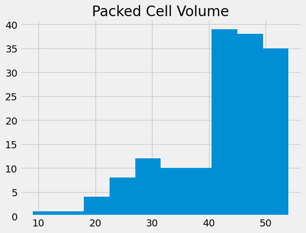
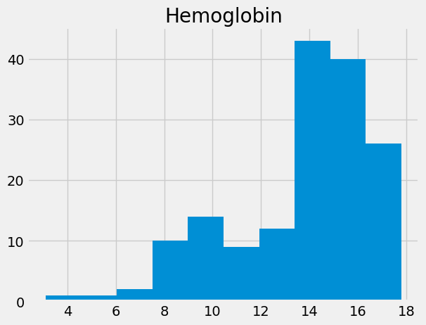
We are interested in two columns from this data frame, “Packed Cell Volume” and “Hemoglobin”.
Packed Cell Volume (PCV) is a measurement of the percentage of blood volume taken up by red blood cells. It is a measurement of anemia, and anemia is a common consequence of chronic kidney disease.
# Get the packed cell volume values as an array, for simplicity.
pcv = np.array(ckd['Packed Cell Volume'])
# Show the distribution.
plt.hist(pcv)
plt.title('Packed Cell Volume');
“Hemoglobin” (HGB) is the concentration of the hemoglobin molecule in blood, in grams per deciliter. Hemoglobin is the iron-containing protein in red blood cells that carries oxygen to the tissues.
# Get the hemoglobin concentration values as an array.
hgb = np.array(ckd['Hemoglobin'])
# Show the distribution.
plt.hist(hgb)
plt.title('Hemoglobin');
Looking for straight lines#
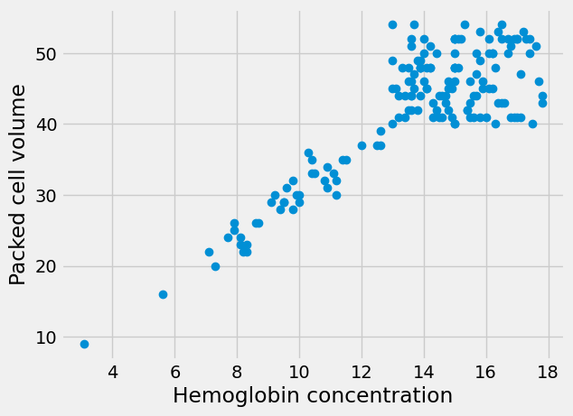
The Wikipedia page for PCV says (at the time of writing):
An estimated hematocrit as a percentage may be derived by tripling the hemoglobin concentration in g/dL and dropping the units. source.
This rule-of-thumb suggests that the values for PCV will be roughly three times the values for HGB.
Therefore, if we plot the HGB values on the x-axis of a plot, and the PCV values on the y-axis, we should see something that is roughly compatible with a straight line going through 0, 0, and with a slope of about 3.
Here is the plot. This time, for fun, we add a label to the X and Y axes with
xlabel and ylabel.
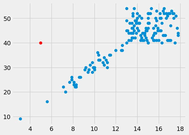
# Plot HGB on the x axis, PCV on the y axis
plt.plot(hgb, pcv, 'o')
plt.xlabel('Hemoglobin concentration')
plt.ylabel('Packed cell volume');
The 'o' argument to the plot function above is a “plot marker”. It tells
Matplotlib to plot the points as points, rather than joining them with lines.
The markers for the points will be filled circles, with 'o', but we can also
ask for other symbols such as plus marks (with '+') and crosses (with 'x').
The line does look a bit like it has a slope of about 3. But - is that true? Is the best slope 3? What slope would we find, if we looked for the best slope? What could best mean, for best slope?
Adjusting axes#
We would like to see what this graph looks like in relation to the origin -
x=0, y=0. In order to this, we can add a plt.axis function call, like this:
# Plot HGB on the x axis, PCV on the y axis
plt.plot(hgb, pcv, 'o')
plt.xlabel('Hemoglobin concentration')
plt.ylabel('Packed cell volume')
# Set the x axis to go from 0 to 18, y axis from 0 to 55.
plt.axis([0, 18, 0, 55]);
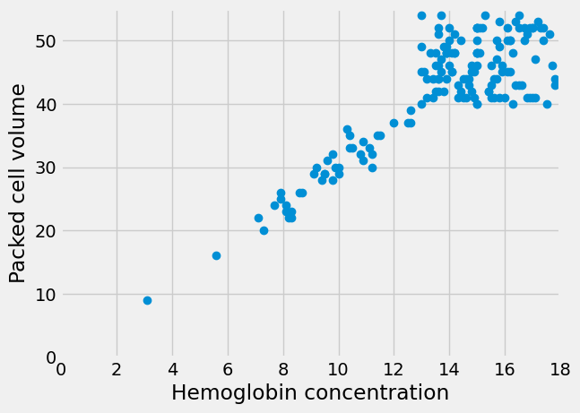
It does look plausible that this line goes through the origin, and that makes sense. All hemoglobin is in red blood cells; we might expect the volume of red blood cells to be zero when the hemoglobin concentration is zero.
Putting points on plots#
Before we go on, we will need some machinery to plot arbitrary points on plots.
In fact this works in exactly the same way as the points you have already seen
on plots. We use the plot function, with a suitable plot marker. The x
coordinates of the points go in the first argument, and the y coordinates go in
the second.
To plot a single point, pass a single x and y coordinate value:
plt.plot(hgb, pcv, 'o')
# A red point at x=5, y=40
plt.plot(5, 40, 'o', color='red')
[<matplotlib.lines.Line2D at 0x7fe3a49ce710>]
To plot more than one point, pass multiple x and y coordinate values:
plt.plot(hgb, pcv, 'o')
# Two red points, one at [5, 40], the other at [10, 50]
plt.plot([5, 10], [40, 50], 'o', color='red')
[<matplotlib.lines.Line2D at 0x7fe3a4adb210>]

The mean as applied to plots#
We want a straight line that fits these points.
The straight line should do the best job it can in predicting the PCV values from the HGB values.
We found that the mean was a good predictor for a distribution of values. We could try and find a line or something similar that went through the mean of the PCV values, at any given HGB value.
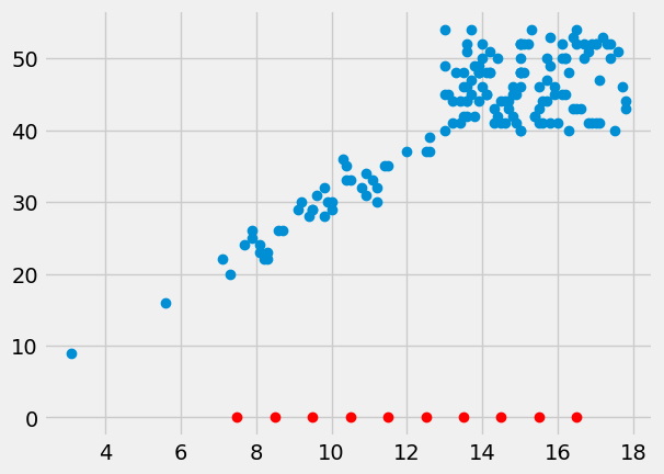
Let’s split the HGB values up into bins centered on 7.5, 8.5, and so on. Then we take the mean of all the PCV values corresponding to HGB values between 7 and 8, 8 and 9, and so on.
# The centers for our HGB bins
hgb_bin_centers = np.arange(7.5, 17.5)
hgb_bin_centers
array([ 7.5, 8.5, 9.5, 10.5, 11.5, 12.5, 13.5, 14.5, 15.5, 16.5])
# The number of bins
n_bins = len(hgb_bin_centers)
n_bins
10
Show the center of the bins on the x axis of the plot.
plt.plot(hgb, pcv, 'o')
plt.plot(hgb_bin_centers, np.zeros(n_bins), 'o', color='red')
[<matplotlib.lines.Line2D at 0x7fe3a4773450>]
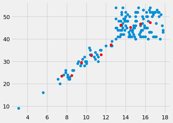
Take the mean of the PCV values for each bin.
pcv_means = np.zeros(n_bins)
for i in np.arange(n_bins):
    mid = hgb_bin_centers[i]
    # Boolean identifying indices within the HGB bin
    fr_within_bin = (hgb >= mid - 0.5) & (hgb < mid + 0.5)
    # Take the mean of the corresponding PCV values
    pcv_means[i] = np.mean(pcv[fr_within_bin])
pcv_means
array([23.4   , 23.7143, 29.5556, 32.5556, 33.    , 37.5   , 46.2069,
       45.2083, 46.7586, 47.4286])
These means should be good predictors for PCV values, given an HGB value. We check the bin of the HGB value and take the corresponding PCV mean as the prediction.
Here is a plot of the means of PCV for every bin:
plt.plot(hgb, pcv, 'o')
plt.plot(hgb_bin_centers, pcv_means, 'o', color='red')
[<matplotlib.lines.Line2D at 0x7fe3a47f07d0>]
Finding a predicting line#
The means per bin give some prediction of the PCV values from the HGB. Can we do better? Can we find a line that predicts the PCV data from the HGB data?
Remember, any line can be fully described by an intercept \(c\) and a slope \(s\). A line predicts the \(y\) values from the \(x\) values, using the slope \(s\) and the intercept \(c\):
The intercept is the value of the line when x is equal to 0. It is therefore where the line crosses the y axis.
In our case, let us assume the intercept is 0. We will assume PCV of 0 if there is no hemoglobin.
Now we want to find a good slope. The slope is the amount that the y values increase for a one unit increase in the x values. In our case, it is the increase in the PCV for a 1 gram / deciliter increase in the HGB.
Let’s guess the slope is 3, as Wikipedia told us it should be:
slope = 3
Remember our line prediction for y (PCV) is:
where x is the HGB. In our case we assume the intercept is 0, so:
pcv_predicted = hgb * slope
pcv_predicted[:10]
array([33.6, 28.5, 32.4, 16.8, 23.1, 29.4, 37.5, 30. , 31.5, 29.4])
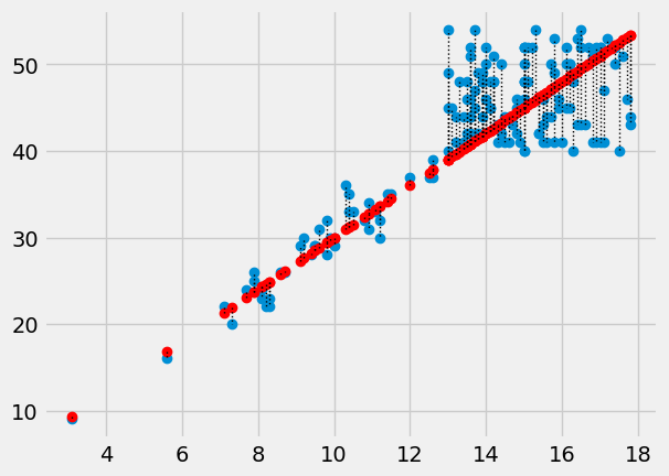
Plot the predictions in red on the original data in blue.
plt.plot(hgb, pcv, 'o')
plt.plot(hgb, pcv_predicted, 'o', color='red')
[<matplotlib.lines.Line2D at 0x7fe3a4846510>]
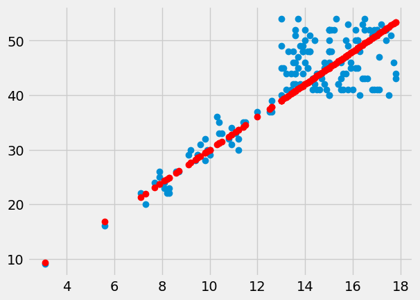
The red are the predictions, the blue are the original data. At each PCV value we have a prediction, and therefore, an error in our prediction; the difference between the predicted value and the actual values.
errors = pcv - pcv_predicted
errors[:10]
array([-1.6, 0.5, -0.4, -0.8, 0.9, 2.6, -0.5, -1. , 1.5, -1.4])
In this plot, for each point, we draw a thin dotted line between the prediction of PCV for each point, and its actual value.
plt.plot(hgb, pcv, 'o')
plt.plot(hgb, pcv_predicted, 'o', color='red')
# Draw a line between predicted and actual
for i in np.arange(len(hgb)):
    x = hgb[i]
    y_0 = pcv_predicted[i]
    y_1 = pcv[i]
    plt.plot([x, x], [y_0, y_1], ':', color='black', linewidth=1)
What is a good line?#
We have guessed a slope, and so defined a line. We calculated the errors from our guessed line.
How would we decide whether our slope was a good one? Put otherwise, how would we decide when we have a good line?
A good line should have small prediction errors. That is, the line should give a good prediction of the points. That is, the line should result in small errors.
We would like a slope that gives us the smallest error.
We would like a metric or score for the line — a single number that tells us how good the line is, in terms of fitting the data.
We will try and find a score (metric) that is low when the line is good, and high when the line is bad. A low means that the errors are low, in some sense, and a high score means the errors are high, in the same sense.
A dangerous, but attractive metric for the line#
One obvious idea for a metric is to add up all the errors, like this:
np.sum(errors)
135.20000000000002
We will want to knock of the sign of the sum of the errors, because we want to penalize negative and positive sums of the errors.
bad_metric = np.abs(np.sum(errors))
bad_metric
135.20000000000002
This number will be small or even zero when the line fits well, because the sum of the errors above the line (positive errors) will be roughly equal to the sum of the errors below the line.
And, in fact, for our case, where we know the intercept is zero, this is a perfectly reasonable metric. If the slope is big, then there are more, larger negative errors and fewer, smaller positive errors. The sum of error will be negative, and the error will be large.
# Slope too large - sum of errors is negative.
predicted_pcv = hgb * 3.5
errors = pcv - predicted_pcv
print('Sum of errors for slope of 3.5')
np.sum(errors)
Sum of errors for slope of 3.5
-946.0999999999999
Conversely for a slope that is too small:
# Slope too small - sum of errors is positive.
predicted_pcv = hgb * 2.5
errors = pcv - predicted_pcv
print('Sum of errors for slope of 2.5')
np.sum(errors)
Sum of errors for slope of 2.5
1216.5
But we will see later, that this metric is very bad when we are trying to find a line where we allow the intercept to be something other than zero, because we can fit all sorts of obviously bad lines by changing the intercept and the slope. So, for now, let us choose another metric.
A better metric for the line#
The Mean as Predictor section showed that the mean is the value with the smallest squared distance from the other values in the distribution. The mean is the predictor value that minimizes the sum of squared distances from the other values.
We can use the same metric for our line. Instead of using a single vector as a predictor, now we are using the values on the line as predictors. We want the HGB slope, in our case, that gives the best predictors of the PCV values. Specifically, we want the slope that gives the smallest sum of squares difference between the line prediction and the actual values.
We have already calculated the prediction and error for our slope of 3, but let’s do it again, and then calculate the Sum of Squared Error (SSE):
slope = 3
predicted_pcv = hgb * slope
errors = pcv - predicted_pcv
# The sum of squared errors.
sse = np.sum(errors ** 2)
sse
3689.340000000001
We are about to do this calculation many times, for many different slopes. We need a function.
In the function below, we are using function
world to get the values of hgb and
pcv defined here at the top level, outside function world. The function can
see these values, from function world.
def calc_sse(slope):
    predicted_pcv = hgb * slope  # 'hgb' comes from the top level
    errors = pcv - predicted_pcv # 'pcv' comes from the top level
    return np.sum(errors ** 2)
First check we get the same answer as the calculation above:
calc_sse(3)
3689.340000000001
Does 3.5 give a higher or lower sum of squared error?
calc_sse(3.5)
9947.535
Now we can use the same strategy as we used in the mean meaning page, to try lots of slopes, and find the one that gives the smallest sum of squared error.
Let us first assemble slopes to try:
some_slopes = np.arange(2, 4, 0.01)
slope_df = pd.DataFrame()
slope_df['slope_to_try'] = some_slopes
slope_df
| slope_to_try | |
|---|---|
| 0 | 2.00 |
| 1 | 2.01 |
| 2 | 2.02 |
| 3 | 2.03 |
| 4 | 2.04 |
| ... | ... |
| 195 | 3.95 |
| 196 | 3.96 |
| 197 | 3.97 |
| 198 | 3.98 |
| 199 | 3.99 |
200 rows × 1 columns
We’re going to go through each slope in the slopes_to_try column. For each slope, we are going to calculate the sum of squared error (SSE) for that slope.
We first make an array to hold the SSE results for each slope. In dur course, this will become a column in our DataFrame.
n_slopes = len(some_slopes)
n_slopes
200
# Array to store the SSE for each slope.
sses = np.zeros(n_slopes)
We first work out the SSE for the first candidate slope.
# The first slope value:
slope_to_try = some_slopes[0]
sse = calc_sse(slope_to_try)
print(f'SSE for', slope_to_try, 'is', sse)
SSE for 2.0 is 37529.64
We could then put it into our DataFrame:
sses[0] = sse
# Put the SSE values into the DataFrame
slope_df['SSE'] = sses
slope_df
| slope_to_try | SSE | |
|---|---|---|
| 0 | 2.00 | 37529.64 |
| 1 | 2.01 | 0.00 |
| 2 | 2.02 | 0.00 |
| 3 | 2.03 | 0.00 |
| 4 | 2.04 | 0.00 |
| ... | ... | ... |
| 195 | 3.95 | 0.00 |
| 196 | 3.96 | 0.00 |
| 197 | 3.97 | 0.00 |
| 198 | 3.98 | 0.00 |
| 199 | 3.99 | 0.00 |
200 rows × 2 columns
Now do the same for all the slopes:
for i in np.arange(n_slopes):  # For each candidate slope.
    # Get the corresponding slope.
    this_slope = some_slopes[i]
    # Calculate the error measure.
    this_error = calc_sse(this_slope)
    # Put the error into the results array at the corresponding position.
    sses[i] = this_error

# Put all the SSE scores into the DataFrame as a column for display.
slope_df['SSE'] = sses
slope_df
| slope_to_try | SSE | |
|---|---|---|
| 0 | 2.00 | 37529.640000 |
| 1 | 2.01 | 36885.282846 |
| 2 | 2.02 | 36247.106584 |
| 3 | 2.03 | 35615.111214 |
| 4 | 2.04 | 34989.296736 |
| ... | ... | ... |
| 195 | 3.95 | 28791.567150 |
| 196 | 3.96 | 29352.483936 |
| 197 | 3.97 | 29919.581614 |
| 198 | 3.98 | 30492.860184 |
| 199 | 3.99 | 31072.319646 |
200 rows × 2 columns
We plot the slopes we have tried, on the x axis, against the sum of squared error, on the y-axis.
plt.plot(slope_df['slope_to_try'], slope_df['SSE'])
plt.xlabel('Candidate slopes')
plt.ylabel('Sum of squared error')
Text(0, 0.5, 'Sum of squared error')
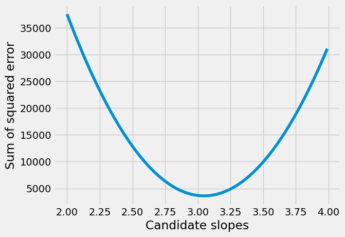
The minimum of the sum of squared error is the value we found:
print('Smallest error', slope_df['SSE'].min())
Smallest error 3619.8091499999964
We have the smallest error, but we’d really like to know which row corresponds to the smallest error, so we can work out which slope gives the smallest error.
Fortunately, Pandas has a method for that, called idxmin. This tells us the row label corresponding to the minimum value, like this:
# Row label corresponding to minimum value.
row_with_min = slope_df['SSE'].idxmin()
row_with_min
105
This label does give us the row with the minimum value:
# Row corresponding to minimum value.
slope_df.loc[row_with_min]
slope_to_try       3.05000
SSE             3619.80915
Name: 105, dtype: float64
Notice SSE contains the same minimum value as you saw above from .min(). But we also see the corresponding slopes_to_try slope value.
best_slope = slope_df.loc[row_with_min, 'slope_to_try']
best_slope
3.0499999999999776
# Confirm that this slope gives the minimum value.
calc_sse(best_slope)
3619.8091499999964
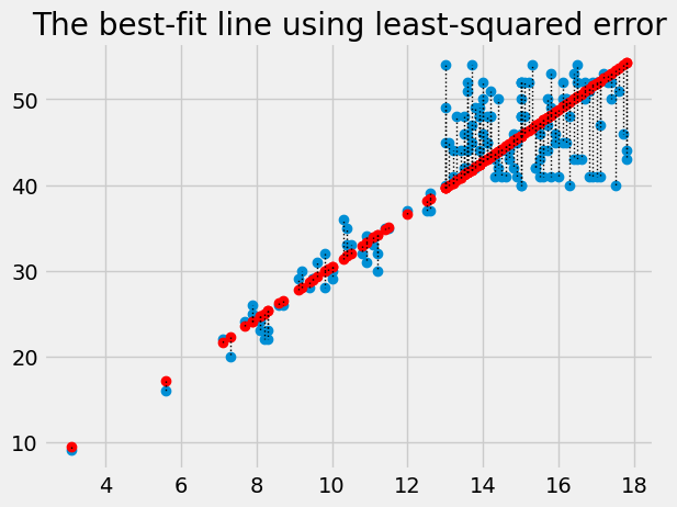
Plot the data, predictions and errors for the line that minimizes the sum of squared error:
best_predicted = hgb * best_slope
plt.plot(hgb, pcv, 'o')
plt.plot(hgb, best_predicted, 'o', color='red')
for i in np.arange(len(hgb)):
    x = hgb[i]
    y_0 = best_predicted[i]
    y_1 = pcv[i]
    plt.plot([x, x], [y_0, y_1], ':', color='black', linewidth=1)
plt.title('The best-fit line using least-squared error')
Text(0.5, 1.0, 'The best-fit line using least-squared error')
The algorithm we have used so far, is rather slow and clunky, because we had to make an array with lots of slopes to try, and then go through each one to find the slope that minimizes the squared error.
In fact, we will soon see, we can use some tricks to get Python to do all this work for us, much more quickly.
Finding techniques for doing this automatically is a whole mathematical field, called optimization.
For now, let’s leap to using these techniques on our problem, of finding the best slope:
from scipy.optimize import minimize
# 3 below is the slope value to start the search.
# method='powell' tells the function the search algorithm to use.
# 'powell' is a good choice for our simple types of problems.
res = minimize(calc_sse, 3, method='powell')
res
 message: Optimization terminated successfully.
 success: True
  status: 0
     fun: 3619.615787818327
       x: [ 3.047e+00]
     nit: 2
   direc: [[ 2.407e-09]]
    nfev: 86
The slope is in the x attribute of the return value:
res.x
array([3.0475])
The magic of maths#
We found the best (sum of squares) slope by trying lots of slopes, above, and then, rather more efficiently, by using minimize to do that job for us.
You don’t need to understand the argument below, to follow this class, but in this case we can work out the best slope with some fairly simple calculus and algebra. It turns out like this:
maths_slope = np.sum(hgb * pcv) / np.sum(hgb ** 2)
maths_slope
3.047498645826524
See the page linked above for why this formula works for any set of x and y values, where the intercept is zero.
But - we won’t be using these mathematical short cuts in this course, we will
be using minimize and friends to find the best slope by trial and error.