The Central Limit Theorem#
Show code cell content
# Don't change this cell; just run it.
import numpy as np
import pandas as pd
# Safe setting for Pandas.  Needs Pandas version >= 1.5.
pd.set_option('mode.copy_on_write', True)
import matplotlib.pyplot as plt
# Make the plots look more fancy.
plt.style.use('fivethirtyeight')
Show code cell content
colors = pd.read_csv('roulette_wheel.csv')['Color']
pockets = ['0','00']
for i in np.arange(1, 37):
    pockets.append(str(i))

wheel = pd.DataFrame()
wheel['Pocket'] = pockets
wheel['Color'] = colors
Note
This page has content from the Central_Limit_Theorem notebook of an older version of the UC Berkeley data science course. See the Berkeley course section of the license file.
Note
This page has content from the At_the_Roulette_Table notebook of an older version of the UC Berkeley data science course. See the Berkeley course section of the license file.
Very few of the data histograms that we have seen in this course have been bell shaped. When we have come across a bell shaped distribution, it has almost invariably been an empirical histogram of a statistic based on a random sample.
The examples below show two very different situations in which an approximate bell shape appears in such histograms.
At the roulette table#
You may have noticed, but we have not emphasized thus far, that our simulations often do generated bell-shaped (normal distribution) curves.
For example, let us explore a gambling game. We will simulate betting on roulette, which is popular in gambling centers such as Las Vegas and Monte Carlo.
The main randomizer in roulette in Nevada is a wheel that has 38 pockets on its rim. Two of the pockets are green, eighteen black, and eighteen red. The wheel is on a spindle, and there is a small ball on the wheel. When the wheel is spun, the ball ricochets around and finally comes to rest in one of the pockets. That is declared to be the winning pocket.
The table wheel represents the pockets of a Nevada roulette wheel.
wheel
| Color | ||
|---|---|---|
| 0 | 0 | green |
| 1 | 00 | green |
| 2 | 1 | red |
| 3 | 2 | black |
| 4 | 3 | red |
| 5 | 4 | black |
| 6 | 5 | red |
| 7 | 6 | black |
| 8 | 7 | red |
| 9 | 8 | black |
| 10 | 9 | red |
| 11 | 10 | black |
| 12 | 11 | black |
| 13 | 12 | red |
| 14 | 13 | black |
| 15 | 14 | red |
| 16 | 15 | black |
| 17 | 16 | red |
| 18 | 17 | black |
| 19 | 18 | red |
| 20 | 19 | red |
| 21 | 20 | black |
| 22 | 21 | red |
| 23 | 22 | black |
| 24 | 23 | red |
| 25 | 24 | black |
| 26 | 25 | red |
| 27 | 26 | black |
| 28 | 27 | red |
| 29 | 28 | black |
| 30 | 29 | black |
| 31 | 30 | red |
| 32 | 31 | black |
| 33 | 32 | red |
| 34 | 33 | black |
| 35 | 34 | red |
| 36 | 35 | black |
| 37 | 36 | red |
A bet on red pays even money, 1 to 1. The function red_winnings
returns the net winnings on one $1 bet on red. Specifically, the function
takes a color as its argument and returns 1 if the color is red. For all other
colors it returns -1.
def red_winnings(color):
    if color == 'red':
        return 1
    else:
        return -1
Here is the result of a bet on red, for each possible pocket on the roulette wheel:
bets = pd.DataFrame()
bets['Color'] = wheel['Color']
bets['Winnings: Red'] = wheel['Color'].apply(red_winnings)
bets
| Color | Winnings: Red | |
|---|---|---|
| 0 | green | -1 |
| 1 | green | -1 |
| 2 | red | 1 |
| 3 | black | -1 |
| 4 | red | 1 |
| 5 | black | -1 |
| 6 | red | 1 |
| 7 | black | -1 |
| 8 | red | 1 |
| 9 | black | -1 |
| 10 | red | 1 |
| 11 | black | -1 |
| 12 | black | -1 |
| 13 | red | 1 |
| 14 | black | -1 |
| 15 | red | 1 |
| 16 | black | -1 |
| 17 | red | 1 |
| 18 | black | -1 |
| 19 | red | 1 |
| 20 | red | 1 |
| 21 | black | -1 |
| 22 | red | 1 |
| 23 | black | -1 |
| 24 | red | 1 |
| 25 | black | -1 |
| 26 | red | 1 |
| 27 | black | -1 |
| 28 | red | 1 |
| 29 | black | -1 |
| 30 | black | -1 |
| 31 | red | 1 |
| 32 | black | -1 |
| 33 | red | 1 |
| 34 | black | -1 |
| 35 | red | 1 |
| 36 | black | -1 |
| 37 | red | 1 |
Suppose you decide to bet $1 on red. Here is a simulation of 1 spin.
one_spin = bets.sample(1)
one_spin
| Color | Winnings: Red | |
|---|---|---|
| 34 | black | -1 |
Here we simulate our winnings for 10000 bets on red:
n_simulations = 5000

colors = np.zeros(n_simulations, dtype=object)  # Strings
winnings_on_red = np.zeros(n_simulations)

for i in np.arange(n_simulations):
    spin = bets.sample(1).iloc[0]
    colors[i] = spin['Color']
    winnings_on_red[i] = spin['Winnings: Red']
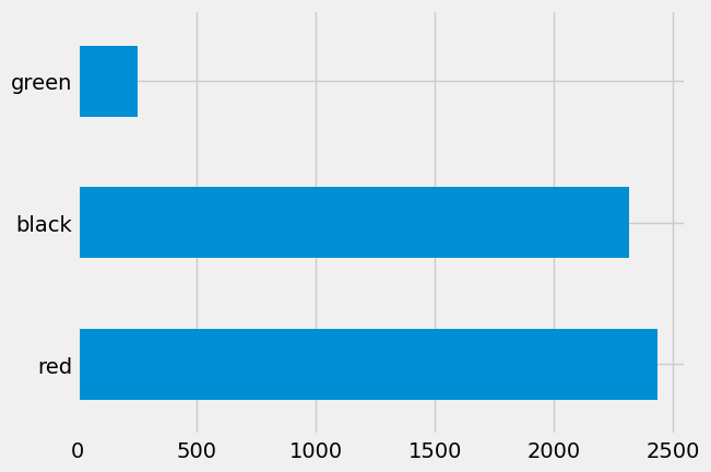
These are the colors we got:
pd.Series(colors).value_counts().plot.barh();
Here are the corresponding winnings:
plt.hist(winnings_on_red, bins=np.arange(-1.5, 1.6, 1));
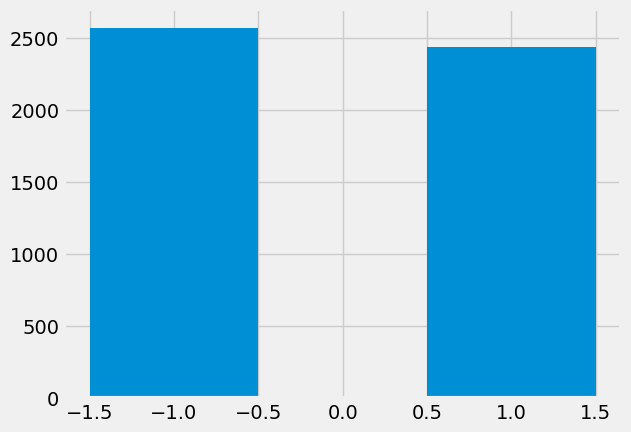
Notice that this distribution is very far from being a bell shaped distribution curve. Now let’s think about net wins after a certain number of bets.
Net gains at roulette#
Your net gain on one bet is one random draw from the Winnings: Red column.
There is an 18/38 chance making $1, and a 20/38 chance of making -$1. This
probability distribution is shown in the histogram above.
Now suppose you bet many times on red. Your net winnings will be the sum of many draws made at random with replacement from the distribution above.
It will take a bit of math to list all the possible values of your net winnings along with all of their chances. We won’t do that; instead, we will approximate the probability distribution by simulation, as we have done all along in this course.
The code below simulates your net gain if you bet $1 on red on 400 different spins of the roulette wheel.
n_bets = 400

colors = np.zeros(n_simulations, dtype=object)  # Strings
net_gain_red = np.zeros(n_simulations)

for i in np.arange(n_simulations):
    spins = bets.sample(n_bets, replace=True)
    net_gain_red[i] = np.sum(spins['Winnings: Red'].sum())

results = pd.DataFrame()
results['Net Gain on Red'] = net_gain_red
results.plot.hist(bins=np.arange(-80, 50, 6))
<Axes: ylabel='Frequency'>
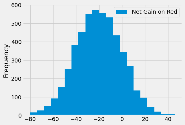
That’s a roughly bell shaped histogram, even though the distribution we are drawing from is nowhere near bell shaped.
Center. The distribution is centered near -20. To see why, note that your winnings will be 1 on about 18/38 of the bets, and -1 on the remaining 20/38. So your average winnings per dollar bet will be roughly -5.26 cents:
average_per_bet = 1 * (18 / 38) + (-1) * (20 / 38)
average_per_bet
-0.05263157894736842
So in 400 bets you expect that your net gain will be about -$21:
400 * average_per_bet
-21.052631578947366
For confirmation, we can compute the mean of the 10,000 simulated net gains:
np.mean(results['Net Gain on Red'])
-21.4184
Spread. Run your eye along the curve starting at the center and notice that the point of inflection is near 0. On a bell shaped curve, the standard deviation (SD) is the distance from the center to a point of inflection. The center is roughly -20, which means that the SD of the distribution is around 20.
In the next section we will see where the 20 comes from. For now, let’s confirm our observation by simply calculating the SD of the 10,000 simulated net gains:
np.std(results['Net Gain on Red'])
20.230851228754563
Summary. The net gain in 400 bets is the sum of the 400 amounts won on each individual bet. The probability distribution of that sum is approximately normal, with an average and an SD that we can approximate.
Average Flight Delay#
The table united contains data on departure delays of 13,667 United Airlines
domestic flights out of San Francisco airport in the summer of 2015. The distribution of delays has a long right-hand tail.
united = pd.read_csv('summer_united.csv')
delays = united['Delay']
delays.plot.hist(bins=np.arange(-20, 300, 10));
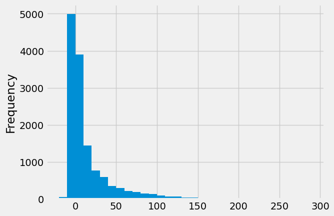
The mean delay was about 16.9 minutes and the SD was about 39.7 minutes. Notice how large the SD is, compared to the mean. Those large deviations on the right have an effect, even though they are a very small proportion of the data.
mean_delay = np.mean(delays)
sd_delay = np.std(delays)

mean_delay, sd_delay
(16.850735347918345, 39.66686982792497)
Now suppose we sampled 400 delays at random with replacement. You could sample without replacement if you like, but the results would be very similar to with-replacement sampling. If you sample a few hundred out of 13,667 without replacement, you hardly change the population each time you pull out a value.
In the sample, what could the average delay be? We expect it to be around 16 or
17, because that’s the population average; but it is likely to be somewhat off.
Let’s see what we get by sampling. We’ll work with the table delay that only
contains the column of delays.
np.mean(delays.sample(400, replace=True))
15.435
The sample average varies according to how the sample comes out, so we will simulate the sampling process repeatedly and draw the empirical histogram of the sample average. That will be an approximation to the probability histogram of the sample average.
sample_size = 400
n_repetitions = 10000

means = np.zeros(n_repetitions)

for i in np.arange(n_repetitions):
    sample = delays.sample(sample_size)
    means[i] = np.mean(sample)
plt.hist(means, bins=np.arange(10, 25, 0.5));
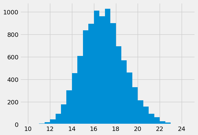
Once again, we see a rough bell shape, even though we are drawing from a very skewed distribution. The bell is centered somewhere between 16 and 17, as we expect.
Central Limit Theorem#
The reason why the bell shape appears in such settings is a remarkable result of probability theory called the Central Limit Theorem.
The Central Limit Theorem says that the probability distribution of the sum or average of a large random sample drawn with replacement will be roughly normal, regardless of the distribution of the population from which the sample is drawn.
Results that can be applied to random samples regardless of the distribution of the population are very powerful, because in data science we rarely know the distribution of the population.
The Central Limit Theorem makes it possible to make inferences with very little knowledge about the population, provided we have a large random sample. That is why it is central to the field of statistical inference.
Proportion of Purple Flowers#
If you remember your biology, you may remember Mendel’s probability model for the colors of the flowers of a species of pea plant. We have mated two pea plants. We know that each has both the purple gene (P), and the white gene (W). Any plant that has one (or two) purple genes, is purple.
Each pea plant will contribute one of its two genes, at random, either P (50% chance) or W (50% chance). The potential outcomes from this mating are:
Gene from pea 1 |
Gene from pea 2 |
Offspring color |
|---|---|---|
P |
P |
Purple |
P |
W |
Purple |
W |
P |
Purple |
W |
W |
White |
Because the probabilities of P or A are equal from each plant, each of these four outcomes is equally likely. So, the model says that the flower colors of the offspring plants are like draws made at random with replacement from {Purple, Purple, Purple, White}.
In a large sample of plants, about what proportion will have purple flowers? We would expect the answer to be about 0.75, the proportion that are purple in the model. And, because proportions are means, the Central Limit Theorem says that the distribution of the sample proportion of purple plants is roughly normal.
We can confirm this by simulation. Let’s simulate the proportion of purple-flowered plants in a sample of 200 plants.
model = pd.DataFrame()
model['Color'] = np.array(['Purple', 'Purple', 'Purple', 'White'])

model
| Color | |
|---|---|
| 0 | Purple |
| 1 | Purple |
| 2 | Purple |
| 3 | White |
n_plants = 200
n_repetitions = 10000
props = np.zeros(n_repetitions)

for i in np.arange(n_repetitions):
    sample = model.sample(n_plants, replace=True)
    new_prop = np.count_nonzero(sample['Color'] == 'Purple') / n_plants
    props[i] = new_prop
plt.hist(props, bins=np.arange(0.65, 0.85, 0.01));
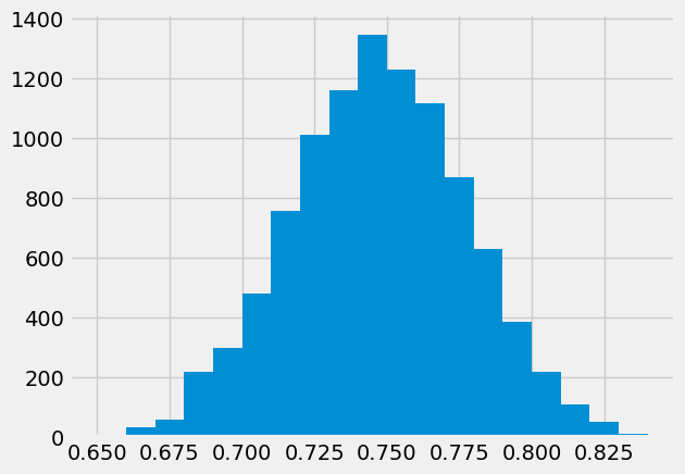
There’s that normal curve again, as predicted by the Central Limit Theorem, centered at around 0.75 just as you would expect.
How would this distribution change if we increased the sample size? Let’s run
the code again with a sample size of 800, and collect the results of
simulations in the same table in which we collected simulations based on a
sample size of 200. We will keep the number of repetitions the same as before
so that the two columns have the same length.
n_plants = 800
props2 = np.zeros(n_repetitions)

for i in np.arange(n_repetitions):
    sample = model.sample(n_plants, replace=True)
    new_prop = np.count_nonzero(sample['Color'] == 'Purple') / n_plants
    props2[i] = new_prop
plt.hist(props2, bins=np.arange(0.65, 0.85, 0.01));
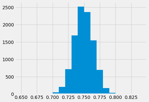
Both distributions are approximately normal but one is narrower than the other. The proportions based on a sample size of 800 are more tightly clustered around 0.75 than those from a sample size of 200. Increasing the sample size has decreased the variability in the sample proportion.
This should not be surprising. We have leaned many times on the intuition that a larger sample size generally reduces the variability of a statistic. However, in the case of a sample average, we can quantify the relationship between sample size and variability.
Exactly how does the sample size affect the variability of a sample average or proportion? That is the question we will examine soon.