Pandas plotting methods#
We start by loading our familiar gender_data dataset.
# Load the Numpy array library, call it 'np'
import numpy as np
# Load the Pandas data science library, call it 'pd'
import pandas as pd
# Turn on a setting to use Pandas more safely.
pd.set_option('mode.copy_on_write', True)
If you are running on your laptop, you should download the
gender_stats_min.csv file to the same
directory as this notebook.
# Load the data file
gender_data = pd.read_csv('gender_stats_min.csv')
gender_data.head()
| country_name | country_code | gdp_us_billion | mat_mort_ratio | population | |
|---|---|---|---|---|---|
| 0 | Aruba | ABW | NaN | NaN | 0.103744 |
| 1 | Afghanistan | AFG | 19.961015 | 444.00 | 32.715838 |
| 2 | Angola | AGO | 111.936542 | 501.25 | 26.937545 |
| 3 | Albania | ALB | 12.327586 | 29.25 | 2.888280 |
| 4 | Andorra | AND | 3.197538 | NaN | 0.079547 |
# Get the GDP values as a Pandas Series
gdp = gender_data['gdp_us_billion']
gdp.head()
0           NaN
1     19.961015
2    111.936542
3     12.327586
4      3.197538
Name: gdp_us_billion, dtype: float64
Plotting with methods#
You have already seen basic plotting with the Matplotlib library.
Here is the magic incantation to load the Matplotlib plotting library.
# Load the library for plotting, name it 'plt'
import matplotlib.pyplot as plt
# Make plots look a little more fancy
plt.style.use('fivethirtyeight')
Here is basic plotting of a Pandas series, using Matplotlib. This is what you have already seen.
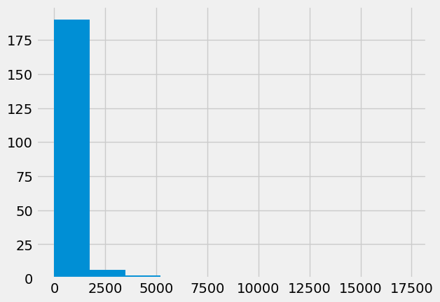
plt.hist(gdp);
It is possible you will see warnings as Matplotlib tried to calculate the bin
widths for the histogram. If you do see them, these warnings result from
Matplotlib struggling with NaN (missing values.
Another way to do the histogram, is to use the hist method of the series.
A method is a function attached to a value. In this case hist is a function attached to a value of type Series.
Using the hist method instead of the plt.hist function can make the code a bit easier to read. The method also has the advantage that it discards the NaN values, by default, so it does not generate the same warnings.
gdp.hist();
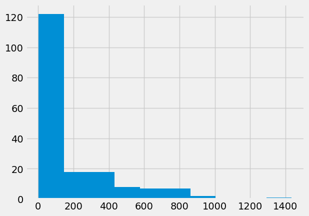
Now we have had a look at the GDP values, we will look at the
values for the mat_mort_ratio column. These are the numbers
of women who die in childbirth for every 100,000 births.
mmr = gender_data['mat_mort_ratio']
mmr
0         NaN
1      444.00
2      501.25
3       29.25
4         NaN
        ...
211       NaN
212    399.75
213    143.75
214    233.75
215    398.00
Name: mat_mort_ratio, Length: 216, dtype: float64
mmr.hist();
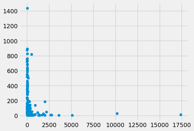
We are interested in the relationship of gpp and mmr. Maybe richer countries have better health care, and fewer maternal deaths.
Here is a plot, using the standard Matplotlib scatter
function.
plt.scatter(gdp, mmr);
We can do the same plot using the plot.scatter method on the data frame. In that case, we specify the column names that should go on the x and the y axes.
gender_data.plot.scatter('gdp_us_billion', 'mat_mort_ratio');
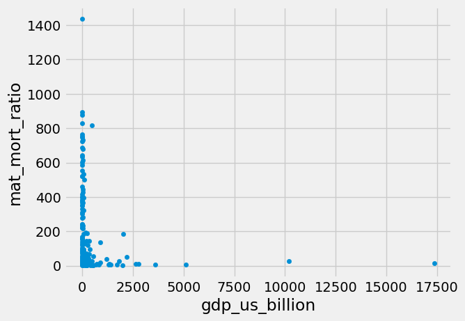
An advantage of doing it this way is that we get the column names on the x and y axes by default.