Expressing the linear model with matrices#
This page is about the notation for linear models.
The linear model can be expressed in terms of matrices. This makes it:
Easier to write equations for the model
Gives a mathematical expression that is easy to solve with matrix functions.
For more detail on the General Linear Model, see The general linear model and fMRI: Does love last forever?.
# Import numerical, data and plotting libraries
import numpy as np
import numpy.linalg as npl
import pandas as pd
pd.set_option('mode.copy_on_write', True)
import matplotlib.pyplot as plt
# Only show 6 decimals when printing
np.set_printoptions(precision=6)
<Token var=<ContextVar name='format_options' default={'edgeitems': 3, 'threshold': 1000, 'floatmode': 'maxprec', 'precision': 8, 'suppress': False, 'linewidth': 75, 'nanstr': 'nan', 'infstr': 'inf', 'sign': '-', 'formatter': None, 'legacy': 9223372036854775807, 'override_repr': None} at 0x7f58e0bcf1a0> at 0x7f58a6724280>
This page starts with the model for simple regression. We then show how the simple regression gets expressed in a design matrix. Once we have that, it’s easy to extend simple regression to multiple regression. By adding some specially formed regressors, we can also express group membership.
Simple regression#
We return to the example in linear regression notation, predicting “prestige” scores for professions, from various other measures.
df = pd.read_csv('data/Duncan_Occupational_Prestige_Reduced.csv')
df
| name | type | income | education | prestige | |
|---|---|---|---|---|---|
| 0 | lawyer | prof | 76 | 98 | 89 |
| 1 | banker | prof | 78 | 82 | 92 |
| 2 | machine.operator | bc | 21 | 20 | 24 |
| 3 | soda.clerk | bc | 12 | 30 | 6 |
| 4 | bartender | bc | 16 | 28 | 7 |
| 5 | waiter | bc | 8 | 32 | 10 |
| 6 | policeman | bc | 34 | 47 | 41 |
| 7 | teacher | prof | 48 | 91 | 73 |
| 8 | professor | prof | 64 | 93 | 93 |
| 9 | shoe.shiner | bc | 9 | 17 | 3 |
| 10 | machinist | bc | 36 | 32 | 57 |
| 11 | minister | prof | 21 | 84 | 87 |
| 12 | pilot | prof | 72 | 76 | 83 |
| 13 | electrician | bc | 47 | 39 | 53 |
| 14 | store.manager | prof | 42 | 44 | 45 |
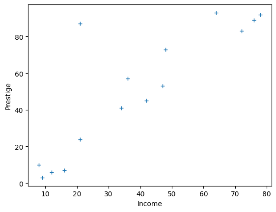
Let’s start off trying to predict prestige with income:
prestige = df['prestige']
income = df['income']
plt.plot(income, prestige, '+')
plt.xlabel('Income')
plt.ylabel('Prestige');
Let’s immediately rename the values we are predicting to y, and the
values we are predicting with to x:
y = prestige
x = income
Set n to the number of observations (observational units, rows):
n = len(prestige)
n
15
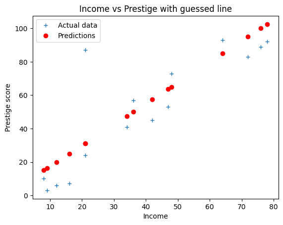
For this page we will start with a preliminary guess for a straight line that links
the income scores to the prestige scores. It looks like the prestige scores go up by about 50 as the income scores rise from 10 to 50. The matching intercept looks like it could be around 5.
b = 50 / 40
c = 5
We use this line to predict the prestige scores from the income scores.
predicted = b * income + c
predicted
0     100.00
1     102.50
2      31.25
3      20.00
4      25.00
5      15.00
6      47.50
7      65.00
8      85.00
9      16.25
10     50.00
11     31.25
12     95.00
13     63.75
14     57.50
Name: income, dtype: float64
# Plot the data and the predictions
plt.plot(x, y, '+', label='Actual data')
plt.plot(x, predicted, 'ro', label='Predictions')
plt.xlabel('Income')
plt.ylabel('Prestige score')
plt.title('Income vs Prestige with guessed line')
plt.legend()
<matplotlib.legend.Legend at 0x7f58e0b96250>
As you saw in regression notation, we can write out this model more formally and more generally in mathematical symbols.
\(\newcommand{\yvec}{\vec{y}} \newcommand{\xvec}{\vec{x}} \newcommand{\evec}{\vec{\varepsilon}}\)
We write our y (prestige) data \(\yvec\) — a vector with 15 values, one
for each profession.
\(y_1\) is the value for the first profession and \(y_i\) is the value for profession \(i\) where \(i \in 1 .. 15\):
Show code cell source
# Ignore this cell - it is to give a better display to the mathematics.
# Import Symbolic mathematics routines.
from sympy import Eq, Matrix, IndexedBase, symbols, init_printing
from sympy.matrices import MatAdd, MatMul, MatrixSymbol

# Make equations print in definition order.
init_printing(order='none')

sy_y = symbols(r'\vec{y}')
sy_y_ind = IndexedBase("y")
vector_indices = range(1, n + 1)
sy_y_val = Matrix([sy_y_ind[i] for i in vector_indices])

Eq(sy_y, Eq(sy_y_val, Matrix(y)), evaluate=False)
x (the income score) is a predictor. Lets call the income scores \(\xvec\).
\(\xvec\) is another vector with 15 values. \(x_1\) is the value for the first
profession and \(x_i\) is the value for profession \(i\) where \(i \in 1 .. 15\).
Show code cell source
# Ignore this cell - it is to give a better display to the mathematics.
sy_x = symbols(r'\vec{x}')
sy_x_ind = IndexedBase("x")
sy_x_val = Matrix([sy_x_ind[i] for i in vector_indices])
Eq(sy_x, Eq(sy_x_val, Matrix(x)), evaluate=False)
In regression notation, we wrote our straight line model as:
\(y_i = bx_i + c + e_i\)
Simple regression in matrix form#
It turns out it will be useful to rephrase the simple regression model in matrix form. Let’s make the data and predictor and errors into vectors.
We already the \(y\) values in our \(\yvec\) vector above, and the \(x\) values in the \(\xvec\) vector.
\(\evec\) is the vector of as-yet-unknown errors \(e_1, e_2, ... e_{15}\). The values of the errors depend on the predicted values, and therefore, on our slope \(b\) and intercept \(c\).
We calculate the errors as:
e = y - predicted
We write the errors as an error vector:
Show code cell source
# Ignore this cell.
sy_e = symbols(r'\vec{\varepsilon}')
sy_e_ind = IndexedBase("e")
sy_e_val = Matrix([sy_e_ind[i] for i in vector_indices])
Eq(sy_e, sy_e_val, evaluate=False)
Now we can rephrase our model as:
Show code cell source
# Ignore this cell.
sy_b, sy_c = symbols('b, c')
sy_c_mat = MatrixSymbol('c', n, 1)
rhs = MatAdd(MatMul(sy_b, sy_x_val), sy_c_mat, sy_e_val)
Eq(sy_y_val, rhs, evaluate=False)
Confirm this is true when we calculate on our particular values:
# Confirm that y is close as dammit to b * x + c + e
assert np.allclose(y, b * x + c + e)
Bear with with us for a little trick. We define \(\vec{o}\) as a vector of ones, like this:
Show code cell source
# Ignore this cell.
sy_o = symbols(r'\vec{o}')
sy_o_val = Matrix([1 for i in vector_indices])
Eq(sy_o, sy_o_val, evaluate=False)
In code, in our case:
o = np.ones(n)
Now we can rewrite the formula as:
because \(o_i = 1\) and so \(co_i = c\).
Show code cell source
# Ignore this cell.
rhs = MatAdd(MatMul(sy_b, sy_x_val), MatMul(sy_c, sy_o_val), sy_e_val)
Eq(sy_y_val, rhs, evaluate=False)
This evaluates to the result we intend:
Show code cell source
# Ignore this cell.
Eq(sy_y_val, sy_c * sy_o_val + sy_b * sy_x_val + sy_e_val, evaluate=False)
# Confirm that y is close as dammit to b * x + c * o + e
assert np.allclose(y, b * x + c * o + e)
\(\newcommand{Xmat}{\boldsymbol X} \newcommand{\bvec}{\vec{\beta}}\)
We can now rephrase the calculation in terms of matrix multiplication.
Call \(\Xmat\) the matrix of two columns, where the first column is \(\xvec\) and the second column is the column of ones (\(\vec{o}\) above).
In code, for our case:
X = np.stack([x, o], axis=1)
X
array([[76.,  1.],
       [78.,  1.],
       [21.,  1.],
       [12.,  1.],
       [16.,  1.],
       [ 8.,  1.],
       [34.,  1.],
       [48.,  1.],
       [64.,  1.],
       [ 9.,  1.],
       [36.,  1.],
       [21.,  1.],
       [72.,  1.],
       [47.,  1.],
       [42.,  1.]])
Call \(\bvec\) the column vector:
In code:
B = np.array([b, c])
B
array([1.25, 5. ])
This gives us exactly the same calculation as \(\yvec = b \xvec + c + \evec\) above, but in terms of matrix multiplication:
Show code cell source
# Ignore this cell.
sy_beta_val = Matrix([[sy_b], [sy_c]])
sy_xmat_val = Matrix.hstack(sy_x_val, sy_o_val)
Eq(sy_y_val, MatAdd(MatMul(sy_xmat_val, sy_beta_val), sy_e_val), evaluate=False)
In symbols:
Because of the way that matrix multiplication works, this again gives us the intended result:
Show code cell source
# Ignore this cell.
Eq(sy_y_val, sy_xmat_val @ sy_beta_val + sy_e_val, evaluate=False)
We write matrix multiplication in Numpy as @:
# Confirm that y is close as dammit to X @ B + e
assert np.allclose(y, X @ B + e)
We still haven’t found our best fitting line. But before we go further, it might be clear that we can easily add a new predictor here.
Multiple regression#
We might also believe that prestige increases with the education level associated with that profession.
Let us add education level as another predictor.
education = df['education']
Now rename the income predictor vector from \(\xvec\) to
\(\xvec_1\).
# income (our previous x) is the first column we will use to predict.
x_1 = income
Of course \(\xvec_1\) has 15 values \(x_{1, 1}..x_{1, 15}\). Call the education
predictor vector \(\xvec_2\).
# education is the second column we use to predict
x_2 = education
Call the slope for income \(b_1\) (slope for \(\xvec_1\)). Call the slope for
education \(b_2\) (slope for \(\xvec_2\)). Our model is:
Show code cell source
# Ignore this cell.
sy_b_1, sy_b_2 = symbols('b_1, b_2')
sy_x_1_ind = IndexedBase("x_1,")
sy_x_1_val = Matrix([sy_x_1_ind[i] for i in vector_indices])
sy_x_2_ind = IndexedBase("x_2,")
sy_x_2_val = Matrix([sy_x_2_ind[i] for i in vector_indices])
Eq(sy_y_val, MatAdd(MatMul(sy_b_1, sy_x_1_val), MatMul(sy_b_2, sy_x_2_val), sy_c_mat, sy_e_val), evaluate=False)
In this model \(\Xmat\) has three columns (\(\xvec_1\), \(\xvec_2\) and ones), and the \(\bvec\) vector has three values \(b_1, b_2, c\). This gives the same matrix formulation, with our new \(\Xmat\) and \(\bvec\): \(\yvec = \Xmat \bvec + \evec\).
This is a linear model because our model says that the data \(y_i\) comes from the sum of some components (\(b_1 x_{1, i}, b_2 x_{2, i}, c, e_i\)).
We can keep doing this by adding more and more regressors. In general, a linear model with \(p\) predictors looks like this:
In the case of the models above, the final predictor \(\xvec_p\) would be a column of ones, to express the intercept in the model.
Any model of the form above can still be phrased in the matrix form:
where:
Show code cell source
# Ignore this cell.
sy_xmat3_val = Matrix.hstack(sy_x_1_val, sy_x_2_val, sy_o_val)
sy_Xmat = symbols(r'\boldsymbol{X}')
Eq(sy_Xmat, sy_xmat3_val, evaluate=False)
In code in our case:
# Design X in values
X_3_cols = np.stack([x_1, x_2, o], axis=1)
X_3_cols
array([[76., 98.,  1.],
       [78., 82.,  1.],
       [21., 20.,  1.],
       [12., 30.,  1.],
       [16., 28.,  1.],
       [ 8., 32.,  1.],
       [34., 47.,  1.],
       [48., 91.,  1.],
       [64., 93.,  1.],
       [ 9., 17.,  1.],
       [36., 32.,  1.],
       [21., 84.,  1.],
       [72., 76.,  1.],
       [47., 39.,  1.],
       [42., 44.,  1.]])
In symbols:
Show code cell source
# Ignore this cell.
sy_beta2_val = Matrix([sy_b_1, sy_b_2, sy_c])
Eq(sy_y_val, MatAdd(MatMul(sy_xmat3_val, sy_beta2_val), sy_e_val), evaluate=False)
As we were hoping, this evaluates to:
Show code cell source
# Ignore this cell.
Eq(sy_y_val, sy_xmat3_val @ sy_beta2_val + sy_e_val, evaluate=False)
Population, sample, estimate#
\(\newcommand{\bhat}{\hat{\bvec}} \newcommand{\yhat}{\hat{\yvec}}\) Our professions and their prestige scores are a sample from the population of all professions’ prestige scores. The parameters \(\bvec\) are the parameters that fit the design \(\Xmat\) to the population scores. We only have a sample from this population, so we cannot get the true population \(\bvec\) vector, we can only estimate \(\bvec\) from our sample. We will write this sample estimate as \(\bhat\) to distinguish it from the true population parameters \(\bvec\).
Solving the model with matrix algebra#
The reason to formulate our problem with matrices is so we can use some basic matrix algebra to estimate the “best” line.
Let’s assume that we want an estimate for the line parameters (intercept and slope) that gives the smallest “distance” between the estimated values (predicted from the line), and the actual values (the data).
We’ll define ‘distance’ as the squared difference of the predicted value from the actual value. These are the squared error terms \(e_1^2, e_2^2 ... e_{n}^2\), where \(n\) is the number of observations; 15 in our case.
As a reminder: our model is:
Where \(\yvec\) is the data vector \(y_1, y_2, ... y_n\), \(\Xmat\) is the design matrix of shape \(n, p\), \(\bvec\) is the parameter vector, \(b_1, b_2 ... b_p\), and \(\evec\) is the error vector giving errors for each observation \(\epsilon_1, \epsilon_2 ... \epsilon_n\).
Each column of \(\Xmat\) is a regressor vector, so \(\Xmat\) can be thought of as the column concatenation of \(p\) vectors \(\xvec_1, \xvec_2 ... \xvec_p\), where \(\xvec_1\) is the first regressor vector, and so on.
In our case, we want an estimate \(\bhat\) for the vector \(\bvec\) such that the errors \(\evec = \yvec - \Xmat \bhat\) have the smallest sum of squares \(\sum_{i=1}^n{e_i^2}\). \(\sum_{i=1}^n{e_i^2}\) is called the residual sum of squares.
When we have our \(\bhat\) estimate, then the prediction of the data from the estimate is given by \(\Xmat \bhat\).
We call this the predicted or estimated data, and write it as \(\yhat\). The errors are then given by \(\yvec - \yhat\).
We might expect that, when we have found the right \(\bhat\) then the errors will have nothing in them that can still be explained by the design matrix \(\Xmat\). This is the same as saying that, when we have best prediction of the data (\(\yhat = \Xmat \bhat\)), the design matrix \(\Xmat\) should be orthogonal to the remaining error (\(\yvec - \yhat\)).
For those of you who have learned about vectors in mathematics, you may remember that we say that two vectors are orthogonal if they have a dot product of zero.
If the design is orthogonal to the errors, then \(\Xmat^T \evec\) should be a vector of zeros.
If that is the case then we can multiply \(\yvec = \Xmat \bhat + \evec\) through by \(\Xmat^T\):
The last term now disappears because it is zero and:
If \(\Xmat^T \Xmat\) is invertible (has a matrix inverse \((\Xmat^T \Xmat)^{-1}\)) then there is a unique solution:
It turns out that, if \(\Xmat^T \Xmat\) is not invertible, there are an infinite number of solutions, and we have to choose one solution, taking into account that the parameters \(\bhat\) will depend on which solution we chose. The pseudoinverse operator gives us one particular solution. If \(\bf{A}^+\) is the pseudoinverse of matrix \(\bf{A}\) then the general solution for \(\bhat\), even when \(\Xmat^T \Xmat\) is not invertible, is:
Using this matrix algebra, what line do we estimate for prestige
and income?
X = np.column_stack((income, np.ones(n)))
X
array([[76.,  1.],
       [78.,  1.],
       [21.,  1.],
       [12.,  1.],
       [16.,  1.],
       [ 8.,  1.],
       [34.,  1.],
       [48.,  1.],
       [64.,  1.],
       [ 9.,  1.],
       [36.,  1.],
       [21.,  1.],
       [72.,  1.],
       [47.,  1.],
       [42.,  1.]])
# Use the pseudoinverse to get estimated B
B = npl.pinv(X) @ prestige
B
array([1.181791, 4.855621])
# Plot the data
plt.plot(income, prestige, '+')
[<matplotlib.lines.Line2D at 0x7f58a2a0c310>]
best_slope = B[0]
best_intercept = B[1]
best_predictions = best_intercept + best_slope * income
# Plot the new prediction
plt.plot(income, prestige, '+', label='Actual data')
plt.plot(income, best_predictions, 'ro', label='Best predictions')
plt.xlabel('Income')
plt.ylabel('Prestige score')
plt.title('Income vs Prestige with best line')
plt.legend();
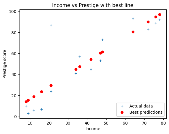
Our claim was that this estimate for slope and intercept minimize the sum (and therefore mean) of squared error:
fitted = X @ B
errors = prestige - fitted
print(np.sum(errors ** 2))
4590.079332315554
Is this sum of squared errors smaller than our earlier guess of an intercept of 10 and a slope of 0.9?
fitted = X @ [0.9, 10]
errors = prestige - fitted
print(np.sum(errors ** 2))
5778.959999999999
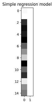
Displaying the design matrix as an image#
We can show the design as an image, by scaling the values with columns.
We scale within columns because we care more about seeing variation within the regressor than between regressors. For example, if we have a regressor varying between 0 and 1, and another between 0 and 1000, without scaling, the column with the larger numbers will swamp the variation in the column with the smaller numbers.
def scale_design_mtx(X):
    """utility to scale the design matrix for display

    This scales the columns to their own range so we can see the variations
    across the column for all the columns, regardless of the scaling of the
    column.
    """
    mi, ma = np.min(X, axis=0), np.max(X, axis=0)
    # Vector that is True for columns where values are not
    # all almost equal to each other
    col_neq = (ma - mi) > 1.e-8
    Xs = np.ones_like(X)
    # Leave columns with same value throughout with 1s
    # Scale other columns to min, max in column
    mi = mi[col_neq]
    ma = ma[col_neq]
    Xs[:,col_neq] = (X[:,col_neq] - mi)/(ma - mi)
    return Xs
Then we can display the scaled design with a title and some default image display parameters, to see our design at a glance.
plt.imshow(scale_design_mtx(X), cmap='gray')
plt.title('Simple regression model');