Multiple Logistic Regression, Model Selection and Cross-validation#
On this page we will cover:
a bit more on the logistic regression cost function
logistic regression models with multiple predictors
model selection/building using cross-validation and grid search
model selection using/building Akaike Information Criterion (if there is time)
In data science, typically we have a sample of observational units, and we are interested in the underlying population from which those observational units were drawn.
Model selection involves the process of evaluating which model we should use to best describe and predict using the data we have, whilst attempting to ensure that our model parameters will generalize to unseen data from the same population.
This can involve choosing which type of model to use (e.g. which regression model or machine learning technique) as well as choosing which predictors should be in our model.
The model selection components of this class apply to other regression models (like linear regression) and to other machine learning techniques also, not just to logistic regression.
On this page we will do the following:
fit a single predictor logistic regression, and go into a bit more detail about the cost function
fit a two predictor logistic regression, to see how it works with more than one predictor
look at model evaluation and selection techniques to decided which model is better (e.g. do we need the second predictor)?
First, let’s import some libraries/functions to set up the page:
import numpy as np
import pandas as pd
# Safe setting for Pandas.
pd.set_option('mode.copy_on_write', True)
import matplotlib.pyplot as plt
import plotly.express as px
import plotly.graph_objects as go
# The formula interface for Statsmodels
import statsmodels.formula.api as smf
# Some printing functions
from jupyprint import arraytex, jupyprint
# Optimization function
from scipy.optimize import minimize
# For interactive widgets.
from ipywidgets import interact
# interactive plotting function
def plotly_3D_with_plane(dataset, x1_string, x2_string, y_string, hover_string_list,
x1_slope, x2_slope, intercept, model_title_string='',
y_1_or_0=True,
probability=False):
"""Interactive 3D scatter, via plotly."""
# create the scatterplot
scatter_3d = px.scatter_3d(dataset, x=x1_string, y=x2_string, z=y_string,
hover_data= hover_string_list, symbol='survived',
color='survived',
symbol_map={1:'x', 0:'o'})
# generate the regression surface
x1 = np.linspace(np.min(dataset[x1_string]), np.max(dataset[x1_string]))
x2 = np.linspace(np.min(dataset[x2_string]), np.max(dataset[x2_string]))
x1, x2 = np.meshgrid(x1, x2)
if probability == False:
y = x1_slope * x1 + x2_slope * x2 + intercept
elif probability == True:
y = inverse_logit(x1_slope * x1 + x2_slope * x2 + intercept)
scatter_3d.add_trace(go.Surface(x=x1, y=x2, z=y, opacity=0.6))
# add a title to the plot and adjust view angle
scatter_3d.update_layout(title=model_title_string,
scene={'camera': {'up': {'x': 0, 'y': 0, 'z': 1},
'center': {'x': 0, 'y': 0, 'z': 0},
'eye': {'x': 1.6, 'y': -1.6, 'z': 0.6}}},
legend={"yanchor" : "top",
"y" : 0.99,
"xanchor" : "left",
"x" : 0.01})
if y_1_or_0==True:
scatter_3d.update_layout(scene={'zaxis': {"tickvals":[0, 1]}})
# show the plot
scatter_3d.show()
More Logistic Regression#
The dataset we will use for this page is a historical social science dataset about the Titanic disaster. Information about the dataset can be found here. A description of the variables in the dataset is below:
name - Passenger Name
gender - Gender of Passenger
age - Age of passenger
class - The class passengers travelled in
embarked - Point of embarkment
country - Country of origin of passenger
fare - Amount paid for the ticket
survived - If they survived the disaster or not
Here the observational units are people/passengers.
Note: the data has been shuffled - the original data was in alphabetical order.
# read in the data
full_df = pd.read_csv('data/titanic.csv')
full_df
| name | gender | age | class | embarked | country | fare | survived | |
|---|---|---|---|---|---|---|---|---|
| 0 | Angheloff, Mr. Minko | male | 26.0 | 3rd | Southampton | Bulgaria | 7.1711 | no |
| 1 | Louch, Mrs. Alice Adelaide | female | 43.0 | 2nd | Southampton | England | 26.0000 | yes |
| 2 | Sawyer, Mr. Frederick Charles | male | 24.0 | 3rd | Southampton | England | 8.0100 | no |
| 3 | Abbing, Mr. Anthony | male | 42.0 | 3rd | Southampton | United States | 7.1100 | no |
| 4 | Givard, Mr. Hans Kristensen | male | 30.0 | 2nd | Southampton | Argentina | 13.0000 | no |
| ... | ... | ... | ... | ... | ... | ... | ... | ... |
| 1208 | Rosblom, Miss. Salli Helena | female | 2.0 | 3rd | Southampton | Finland | 20.0403 | no |
| 1209 | Goldsmith, Master. Frank John William | male | 9.0 | 3rd | Southampton | England | 20.1006 | yes |
| 1210 | Fortune, Mrs. Mary | female | 60.0 | 1st | Southampton | Canada | 263.0000 | yes |
| 1211 | Klaber, Mr. Herman | male | 41.0 | 1st | Southampton | United States | 26.1100 | no |
| 1212 | Andrew, Mr. Edgar Samuel | male | 17.0 | 2nd | Southampton | Argentina | 11.1000 | no |
1213 rows × 8 columns
You’ll remember that we can use logistic regression when we want to predict a binary categorical outcome variable.
In this case, we’ll be interested in predicting whether a passenger survived.
Currently, survived has two categories into which observational units can fall (yes or no).
We’ll dummy code these in the now familiar manner, 1 representing yes and 0 representing no:
survived_dummy \( = \begin{cases} 1, & \text{if \)y_i\( == `yes`} \\ 0, & \text{if \)y_i\( == `no`} \end{cases} \)
# dummy code 'survived'
full_df['survived_dummy'] = full_df['survived'].replace(['yes', 'no'], [1, 0])
full_df
/tmp/ipykernel_3548/3506448988.py:2: FutureWarning: Downcasting behavior in `replace` is deprecated and will be removed in a future version. To retain the old behavior, explicitly call `result.infer_objects(copy=False)`. To opt-in to the future behavior, set `pd.set_option('future.no_silent_downcasting', True)`
full_df['survived_dummy'] = full_df['survived'].replace(['yes', 'no'], [1, 0])
| name | gender | age | class | embarked | country | fare | survived | survived_dummy | |
|---|---|---|---|---|---|---|---|---|---|
| 0 | Angheloff, Mr. Minko | male | 26.0 | 3rd | Southampton | Bulgaria | 7.1711 | no | 0 |
| 1 | Louch, Mrs. Alice Adelaide | female | 43.0 | 2nd | Southampton | England | 26.0000 | yes | 1 |
| 2 | Sawyer, Mr. Frederick Charles | male | 24.0 | 3rd | Southampton | England | 8.0100 | no | 0 |
| 3 | Abbing, Mr. Anthony | male | 42.0 | 3rd | Southampton | United States | 7.1100 | no | 0 |
| 4 | Givard, Mr. Hans Kristensen | male | 30.0 | 2nd | Southampton | Argentina | 13.0000 | no | 0 |
| ... | ... | ... | ... | ... | ... | ... | ... | ... | ... |
| 1208 | Rosblom, Miss. Salli Helena | female | 2.0 | 3rd | Southampton | Finland | 20.0403 | no | 0 |
| 1209 | Goldsmith, Master. Frank John William | male | 9.0 | 3rd | Southampton | England | 20.1006 | yes | 1 |
| 1210 | Fortune, Mrs. Mary | female | 60.0 | 1st | Southampton | Canada | 263.0000 | yes | 1 |
| 1211 | Klaber, Mr. Herman | male | 41.0 | 1st | Southampton | United States | 26.1100 | no | 0 |
| 1212 | Andrew, Mr. Edgar Samuel | male | 17.0 | 2nd | Southampton | Argentina | 11.1000 | no | 0 |
1213 rows × 9 columns
To keep the data easier to visualise, we’ll work with a restricted set of rows. The data has been shuffled before it was imported, so if we take the first 25 rows of the data, this constitutes a random sample, and so is likely to be representative of the whole dataset.
We’ll build an evaluate a variety of different models, using survived as our outcome variable (e.g. our \(y\) variable). We’ll use any (combination) of age, fare and gender as our predictor variables (e.g. our \(x\) variables).
Let’s trim the dataframe down to just the variables of interest:
# isolate only the variables of interest, select the first 25 rows
sample_df = full_df.loc[:25, ['age', 'fare', 'survived', 'gender', 'survived_dummy']]
sample_df
| age | fare | survived | gender | survived_dummy | |
|---|---|---|---|---|---|
| 0 | 26.0 | 7.1711 | no | male | 0 |
| 1 | 43.0 | 26.0000 | yes | female | 1 |
| 2 | 24.0 | 8.0100 | no | male | 0 |
| 3 | 42.0 | 7.1100 | no | male | 0 |
| 4 | 30.0 | 13.0000 | no | male | 0 |
| 5 | 22.0 | 7.1511 | no | male | 0 |
| 6 | 19.0 | 8.0100 | no | male | 0 |
| 7 | 25.0 | 13.0000 | no | male | 0 |
| 8 | 32.0 | 15.1000 | no | female | 0 |
| 9 | 50.0 | 65.0000 | yes | female | 1 |
| 10 | 62.0 | 10.1000 | yes | male | 1 |
| 11 | 21.0 | 7.1500 | no | female | 0 |
| 12 | 26.0 | 7.1711 | no | male | 0 |
| 13 | 34.0 | 81.1702 | yes | female | 1 |
| 14 | 21.0 | 31.1000 | no | male | 0 |
| 15 | 52.0 | 30.0000 | yes | female | 1 |
| 16 | 19.0 | 26.0508 | yes | female | 1 |
| 17 | 23.0 | 13.0000 | no | male | 0 |
| 18 | 9.0 | 46.1800 | no | male | 0 |
| 19 | 22.0 | 7.0406 | no | male | 0 |
| 20 | 36.0 | 8.0100 | no | male | 0 |
| 21 | 36.0 | 120.0000 | yes | male | 1 |
| 22 | 5.0 | 27.1800 | no | male | 0 |
| 23 | 17.0 | 7.1711 | no | male | 0 |
| 24 | 1.0 | 39.0000 | yes | male | 1 |
| 25 | 30.0 | 13.1702 | yes | female | 1 |
And just to save some typing, let’s store the first predictor we will use (fare) and the outcome variable (survived_dummy) as numpy arrays:
# store `fare` and `survived_dummy` as numpy arrays
fare = sample_df['fare'].values
survived_dummy = sample_df['survived_dummy'].values
Our first logistic model - and two perspectives on the cost function#
We’ll now fit our first logistic regression model on this page. We’ll predict survived as a function of fare.
Were richer people more likely to survive the disaster?
As always, it’s best to do some graphical analysis first, before fitting the model:
# a convenience function to generate the scatterplot
def plot_scatter(log_odds=False):
if log_odds==False:
# Build plot, add custom labels.
colors = sample_df['survived_dummy'].replace([1, 0], ['red', 'blue'])
sample_df.plot.scatter('fare', 'survived_dummy', c=colors)
plt.ylabel('Survived\n0 = NO, 1 = YES')
plt.yticks([0,1]); # Just label 0 and 1 on the y axis.
# Put a custom legend on the plot.
plt.scatter([], [], c='blue', label='NO')
plt.scatter([], [], c='red', label='YES')
plt.legend()
if log_odds==True:
# Build plot, add custom labels.
colors = sample_df['survived_dummy'].replace([1, 0], ['red', 'blue'])
pd.DataFrame({'fare':fare,
'log_odds_of_survival': log_odds_predictions_single_predictor}).plot.scatter('fare', 'log_odds_of_survival', c=colors)
plt.ylabel('Predicted Log odds of Survival')
# Put a custom legend on the plot. This code is a little obscure.
plt.scatter([], [], c='blue', label='NO')
plt.scatter([], [], c='red', label='YES')
plt.legend()
plot_scatter()
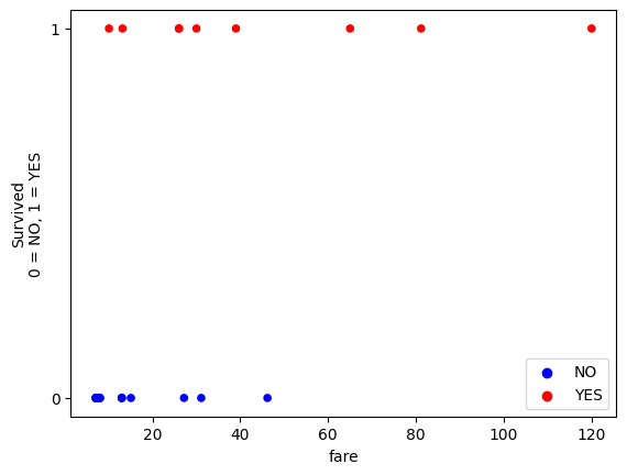
From the graphical trend, it does look as though fare is associated with a higher probability of survival.
In fact, in this sample of 25 passengers, everybody who paid above 60 survived.
The process of fitting our single predictor linear regression is as follows:
we want to predict a binary categorical outcome variable (where each outcome category is dummy coded as 0 or 1)
we use a slope/intercept pair to generate a line (this line applies on the scale of the log of the odds)
we then use the inverse logit transformation to convert the line into a probability curve
the fit of this curve is evaluated against the actual data by finding the maximum likelihood (the line which maximizes the probability of observing the actual data)
(in practice, to make the numbers easier for a computer to deal with we
minimizethe negative log-likelihood)
Let’s define our inverse_logit() function and our cost function:
def inverse_logit(y):
""" Convert a line on the log odds scale to a sigmoid probability curve.
"""
odds = np.exp(y) # Reverse the log operation.
return odds / (odds + 1) # Reverse odds operation.
def mll_logit_cost_one_predictor(intercept_and_slope, x1, y):
""" Cost function for maximum log likelihood
Return minus of the log of the likelihood.
"""
# Unpack the intercept and slope
intercept, slope_1 = intercept_and_slope
# Make predictions for on the log odds (straight line) scale.
predicted_log_odds = intercept + slope_1 * x1
# convert these predictions to sigmoid probability predictions
predicted_prob_of_1 = inverse_logit(predicted_log_odds)
# Calculate predicted probabilities of the actual outcome category for each observation.
predicted_probability_of_actual_score = y * predicted_prob_of_1 + (1 - y) * (1 - predicted_prob_of_1)
# Use logs to calculate log of the likelihood
log_likelihood = np.sum(np.log(predicted_probability_of_actual_score))
# Ask minimize to find maximum by adding minus sign.
return -log_likelihood
We can pass our cost function, along with an initial guess at the slope and intercept, to minimize:
logistic_reg_ML_one_pred = minimize(mll_logit_cost_one_predictor, # Cost function
[0, 0.1], # Guessed intercept and slope
args=(fare, survived_dummy), # x and y values
tol=1e-20) # Attend to tiny changes in cost function values.
# Show the result.
logistic_reg_ML_one_pred
message: Optimization terminated successfully.
success: True
status: 0
fun: 11.56520905235432
x: [-2.541e+00 8.280e-02]
nit: 9
jac: [ 0.000e+00 0.000e+00]
hess_inv: [[ 8.814e-01 -3.008e-02]
[-3.008e-02 1.477e-03]]
nfev: 33
njev: 11
# show just the intercept and slope
logistic_reg_ML_one_pred.x
array([-2.54144967, 0.08279907])
As before, let’s check how minimize did against statsmodels:
# Create the model.
log_reg_mod_single_predictor = smf.logit('survived_dummy ~ fare', data=sample_df)
# Fit it.
fitted_log_reg_mod_single_predictor = log_reg_mod_single_predictor.fit()
fitted_log_reg_mod_single_predictor.summary()
Optimization terminated successfully.
Current function value: 0.444816
Iterations 7
| Dep. Variable: | survived_dummy | No. Observations: | 26 |
|---|---|---|---|
| Model: | Logit | Df Residuals: | 24 |
| Method: | MLE | Df Model: | 1 |
| Date: | Tue, 03 Sep 2024 | Pseudo R-squ.: | 0.3104 |
| Time: | 10:06:16 | Log-Likelihood: | -11.565 |
| converged: | True | LL-Null: | -16.771 |
| Covariance Type: | nonrobust | LLR p-value: | 0.001252 |
| coef | std err | z | P>|z| | [0.025 | 0.975] | |
|---|---|---|---|---|---|---|
| Intercept | -2.5415 | 0.944 | -2.691 | 0.007 | -4.392 | -0.691 |
| fare | 0.0828 | 0.039 | 2.146 | 0.032 | 0.007 | 0.158 |
We can see that the estimates are the same between both methods.
Remember that the (log) odds and probabilities relate to the the outcome category which we have dummy coded as 1.
So the fare slope of 0.0828 means that for every 1-unit increase in fare we predict a 0.0828
increase in the log odds of survival.
We can convert this to an odds ratio using np.exp:
fare_odds_ratio = np.exp(fitted_log_reg_mod_single_predictor.params['fare'])
fare_odds_ratio
np.float64(1.086323539461138)
The odds ratio is a multiplier which describes odds change for a 1-unit increase in the predictor variable:
\(\Large e^{b_1} = \frac{\text{odds(survival) at } x + 1}{\text{odds(survival) at } x}\)
We can make this more intuitive by converting it to a percentage change in odds, for a 1-unit increase in the predictor, using the following formula:
\(\text{Percent Change in the Odds=(Odds Ratio−1)×100}\)
(fare_odds_ratio - 1) * 100
np.float64(8.632353946113792)
This means the odds of survival increase by about 8.63% for every 1-unit increase in fare.
Meaning that richer people were more likely to survive the disaster.
We can use the parameters to generate probability predictions for each observational unit,
conditional on their fare score. The probability here is the probability of survival (e.g. the outcome category which we dummy coded as 1).
We can do this using our inverse_logit function.
So logistic regression in the present case tells us:
the log odds of survival, conditional on
farethe odds of survival, conditional on
farethe probability of survival, conditional on
fare
After fitting the model, the parameters come to us on the log odds scale. The mathematical notation for the log odds predictions is:
\( \text{log odds}(y_i == 1) = b_0 + b_1 * x_1\)
Which in pythonic terms is:
\( \text{log odds of survival} = b_0 + b_1 * \) fare
Let’s generate these predictions from our parameters:
# isolate the parameters from the model
intercept_single_predictor = fitted_log_reg_mod_single_predictor.params['Intercept']
fare_slope_single_predictor = fitted_log_reg_mod_single_predictor.params['fare']
# generate the predictions
log_odds_predictions_single_predictor = intercept_single_predictor + fare_slope_single_predictor * fare
log_odds_predictions_single_predictor
array([-1.94768955, -0.38867366, -1.87822939, -1.95274858, -1.46506191,
-1.94934554, -1.87822939, -1.46506191, -1.29118381, 2.84049107,
-1.70517928, -1.94943662, -1.94768955, 4.179369 , 0.03360172,
-0.05747728, -0.38446747, -1.46506191, 1.28221209, -1.95849484,
-1.87822939, 7.39444132, -0.29097073, -1.94768955, 0.68771458,
-1.4509695 ])
We can plot these predictions, and, as expected, see that they form a straight line:
# generate a plot of the predicted log odds of survival
intercept_single_predictor = fitted_log_reg_mod_single_predictor.params['Intercept']
fare_slope_single_predictor = fitted_log_reg_mod_single_predictor.params['fare']
fine_x = np.linspace(np.min(fare), np.max(fare), 1000)
fine_log_odds_predictions_single_predictor = intercept_single_predictor + fare_slope_single_predictor*fine_x
plot_scatter(log_odds=True)
plt.plot(fine_x, fine_log_odds_predictions_single_predictor , linewidth=1, linestyle=':')
plt.title('Predicted Log Odds of Survival');
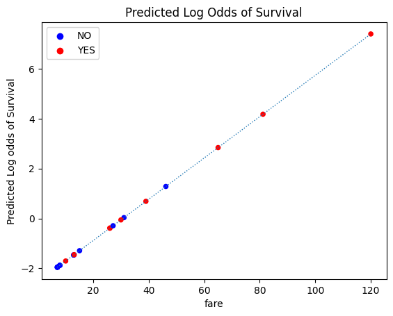
We can use the inverse logit transformation to convert these log odds predictions to probabilities.
We first convert them to odds, and then convert the odds to probabilities. Again, this is the
predicted probability of an observational unit scoring 1 on the outcome variable (which
in this case means surviving).
The mathematical notation for this transformation is:
\( \Large \text{odds}(y_i == 1) = e^{b_{0} + b_{1} * x_{1}}\)
\( \Large \text{prob}(y_i == 1) = \frac{e^{b_{0} + b_{1} * x_{1}}}{1 + e^{b_{0} + b_{1} * x_{1}}}\)
This is simpler in python!:
# shown in pythonic form again, for convenience
def inverse_logit(y):
""" Reverse logit transformation
"""
odds = np.exp(y) # Reverse the log operation.
return odds / (odds + 1) # Reverse odds operation.
# convert the log odds predictions to probabilities
probability_predictions_single_predictor = inverse_logit(log_odds_predictions_single_predictor)
probability_predictions_single_predictor
array([0.12480551, 0.40403663, 0.13259238, 0.12425396, 0.18769434,
0.12462474, 0.13259238, 0.18769434, 0.21565251, 0.94482507,
0.15379003, 0.1246148 , 0.12480551, 0.98492264, 0.50839964,
0.48563463, 0.40504985, 0.18769434, 0.78282609, 0.12363003,
0.13259238, 0.99938572, 0.42776623, 0.12480551, 0.66545833,
0.1898524 ])
If we plot the probability predictions as a function of fare, we see the
sigmoid (s-shaped) probability curve, so us the predicted probability of survival
at each value of fare:
# generate the plot
fine_prob_predictions = inverse_logit(fine_log_odds_predictions_single_predictor)
plot_scatter()
plt.plot(fine_x, fine_prob_predictions, linewidth=1, linestyle=':')
plt.scatter(fare, probability_predictions_single_predictor,
label='Predicted Probability of Survival',
color='gold')
plt.legend(loc=(1.1, 0.5))
plt.title('Predicted Probability of Survival');
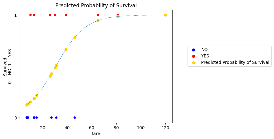
It is on this scale (between 0 and 1, the scale of the actual data) that the fit of a given slope/intercept pair is evaluated.
We went through the mechanics of this on the Logistic Regression page, but just for some extra clarity we will go briefly through it graphically now.
Because the outcome is binary, the logistic regression model implicitly fits two sigmoid probability curves.
The one we see above is the predicted probability of survival.
Because our outcome variable is binary-categorical, we can calculate the predicted probability of death with:
\(\text{P(Death) = 1 - P(Survival)} \)
# calculate the predicted probability of death
probability_of_death = 1 - probability_predictions_single_predictor
probability_of_death
array([8.75194493e-01, 5.95963370e-01, 8.67407619e-01, 8.75746037e-01,
8.12305660e-01, 8.75375262e-01, 8.67407619e-01, 8.12305660e-01,
7.84347493e-01, 5.51749326e-02, 8.46209969e-01, 8.75385198e-01,
8.75194493e-01, 1.50773573e-02, 4.91600359e-01, 5.14365366e-01,
5.94950149e-01, 8.12305660e-01, 2.17173913e-01, 8.76369967e-01,
8.67407619e-01, 6.14282403e-04, 5.72233767e-01, 8.75194493e-01,
3.34541669e-01, 8.10147596e-01])
# generate the plot
plot_scatter()
fine_prob_predictions_death = 1- inverse_logit(fine_log_odds_predictions_single_predictor)
plt.plot(fine_x, fine_prob_predictions_death, linewidth=1, linestyle=':')
plt.scatter(fare, probability_of_death,
label='Predicted Probability of Death',
color='Silver')
plt.legend(loc=(1.1, 0.5))
plt.title('Predicted Probability of Death');
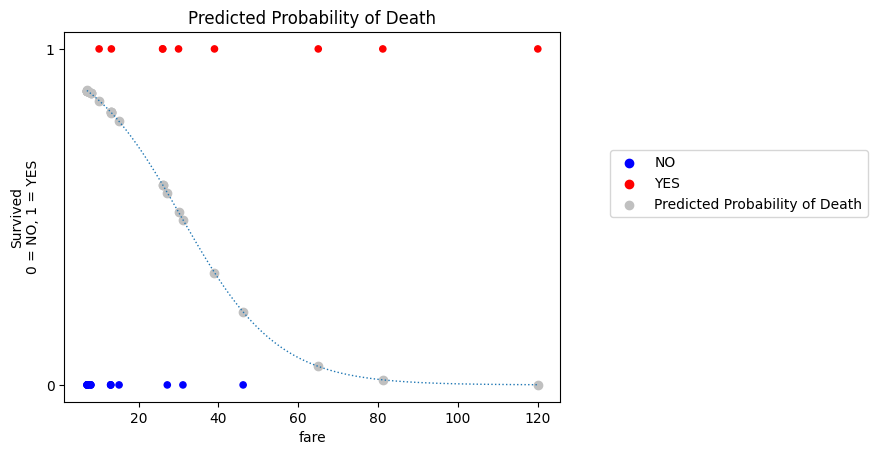
This applies more generally: the model naturally provides predictions for the probability of whichever outcome we coded as 1. But we can get the predicted probability of the outcome being 0 using the subtraction just shown.
We can actually show both of these probability curves (the probability of survival, and the probability of death) on the same graph. The specific predicted probability for each observational unit (passenger) is show as either a silver or gold dot on the respective probability curve (gold for survival, silver for death):
# generate the plot
plot_scatter()
plt.plot(fine_x, fine_prob_predictions, linewidth=1, linestyle=':')
plt.scatter(fare, probability_predictions_single_predictor,
label='Predicted Probability of Survival',
color='gold')
plt.title('Predicted Probability of Survival')
plt.plot(fine_x, fine_prob_predictions_death, linewidth=1, linestyle=':')
plt.scatter(fare, probability_of_death,
label='Predicted Probability of Death',
color='Silver')
plt.legend(loc=(1.1, 0.5))
plt.title('Predicted Probability of Survival/Death');
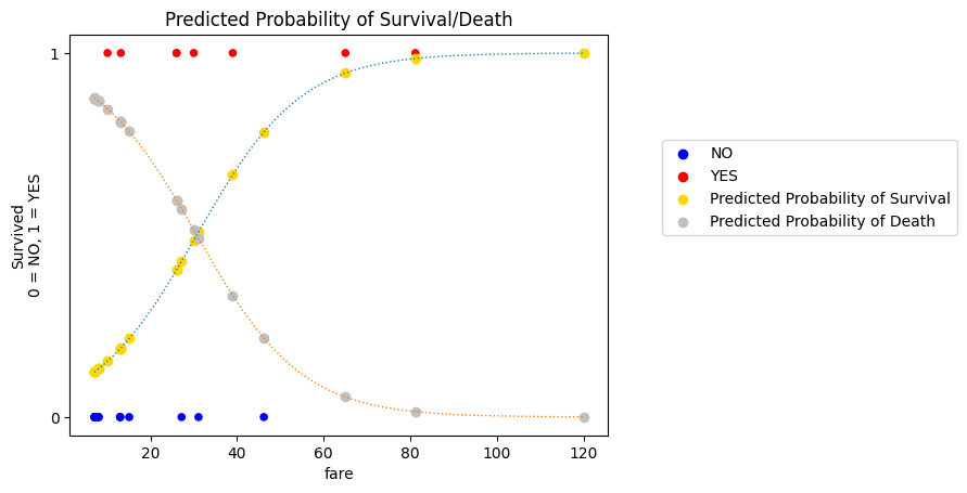
These two curves provide a graphical explanation of how the logistic regression cost function works.
For each observational unit (passenger), we have two predicted probabilities: \(\text{P(Survival)}\) and \(\text{P(Death)}\)
Each passenger also has an actual survived score.
If the passenger survived, then \(\text{P(Survival)}\) matches their actual score.
If the passenger died then \(\text{P(Death)}\) matches their actual score.
Let’s call these “matching probabilities”.
We can show only the matching probability predictions on the graph (compare it to the graph above - you’ll see there is now only one probability prediction per observational unit):
If the passenger survived, then the graph shows the predicted probability \(\text{P(Survival)}\) which matches their actual score.
If the passenger died, then the graph shows the predicted probability \(\text{P(Death)}\) which matches their actual score.
# generate the plot
plot_scatter()
plt.plot(fine_x, fine_prob_predictions, linewidth=1, linestyle=':')
plt.scatter(fare[survived_dummy==1], probability_predictions_single_predictor[survived_dummy==1],
label='Predicted Probability of Survival',
color='gold')
plt.title('Predicted Probability of Survival')
plt.plot(fine_x, fine_prob_predictions_death, linewidth=1, linestyle=':')
plt.scatter(fare[survived_dummy==0], probability_of_death[survived_dummy==0],
label='Predicted Probability of Death',
color='Silver')
plt.legend(loc=(1.1, 0.5))
plt.title('Predicted Probability of Survival/Death');
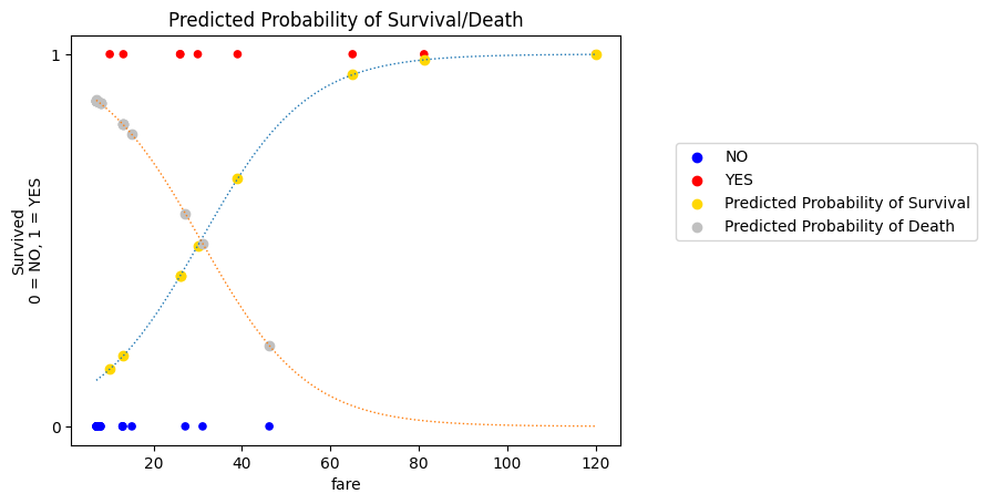
This is how the fit of the of the current slope/intercept pair is evaluated:
we multiply together the matching probabilities. We want the result to be high, meaning that the predicted probability of each passenger’s
survivedscore is high.this is why the fitting technique is referred to as maximum likelihood
We compare the likelihood given by different slope/intercept pairs, and see which pair generates the best-fitting sigmoid curve.
However, multiplying together lots of very small numbers can be difficult for a computer to deal with.
In practice, to make the computations easier for a computer, we minimize the negative log-likelihood. For each
observational unit, the log-likelihood is:
\(\text{If the passenger survived, it is np.log(P(Survived))}\)
\(\text{If the passenger died, it is np.log(P(Death))}\)
We then add these log-likelihoods together, and take the negative of the result (e.g. we just add a minus sign/multiply by minus 1).
This gives us the same parameters as finding the maximum likelihood, but is much easier for a computer to work with.
The negative log-likelihood is also called the log loss and we can think of it (loosely) as a type of prediction error. The graphs below so what the log loss score for a given passenger. The graph of the left shows the log loss if the passenger survived; the graph on the right shows the log loss if the passenger died:
# generate the plot
np.seterr(divide = 'ignore')
predicted_illustration_y = np.linspace(0.001, 1)
loss_if_actual_is_1 = -np.log(predicted_illustration_y)
loss_if_actual_is_0 = -np.log(1-predicted_illustration_y)
plt.figure(figsize=(12, 4))
plt.subplot(1, 2, 1)
plt.plot(predicted_illustration_y, loss_if_actual_is_1, color='red')
plt.xlabel('Predicted Probability of Survival')
plt.title('Actual Outcome == Survived\n $y_i$ == 1')
plt.ylabel('Log Loss\n -np.log(P)')
plt.subplot(1, 2, 2)
plt.plot(predicted_illustration_y, loss_if_actual_is_0, color='blue')
plt.title('Actual Outcome == Died\n $y_i$ == 0')
plt.xlabel('Predicted Probability of Death')
plt.ylabel('Log Loss\n -np.log(P)');
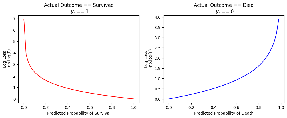
We can see that the log loss is high (high prediction error) if the predicted probability does not match the passengers actual survived score.
Likelihood and log loss are different perspectives/transformations of the same thing:
we want likelihood to be high
we want log loss to be low
Logistic regression in 3D (i.e. with two predictors)#
Now that we’ve found the best-fitting sigmoid for our single predictor model, let’s investigate including multiple predictors in a logistic regression model.
We will then look at some ways of comparing these models, to see if the extra predictor is adding anything useful.
The model we will now fit is survived ~ fare + age.
To save some typing, let’s store age as a separate variable:
# store age as a separate variable
age = sample_df['age'].values
As always, let’s graphically inspect the data, before fitting another model:
# generate the plot
px.scatter_3d(sample_df, 'fare','age', 'survived_dummy', hover_data=['survived'],
symbol='survived',
color='survived',
symbol_map={1:'x', 0:'o'}).update_layout(scene={'zaxis': {"tickvals":[0, 1]}})
We can modify our cost function to accept two predictors. To do this, we just add some extra arguments, and include the new predictor and its slope in the calculation of the predictor log odds scores.
The rest of the cost function is the same:
def mll_logit_cost(intercept_and_slopes, x1, x2, y):
""" Cost function for maximum log likelihood
Return minus of the log of the likelihood.
"""
intercept, slope_1, slope_2 = intercept_and_slopes
# Make predictions for on the log odds (straight line) scale.
predicted_log_odds = intercept + slope_1 * x1 + slope_2 * x2
# convert these predictions to sigmoid probability predictions
predicted_prob_of_1 = inverse_logit(predicted_log_odds)
# Calculate predicted probabilities of the actual score, for each observation.
predicted_probability_of_actual_score = y * predicted_prob_of_1 + (1 - y) * (1 - predicted_prob_of_1)
# Use logs to calculate log of the likelihood
log_likelihood = np.sum(np.log(predicted_probability_of_actual_score))
# Ask minimize to find maximum by adding minus sign.
return -log_likelihood
We then use minimize to find the best fitting parameters (slopes/intercept):
# use minimize to find the best fitting parameters (slopes/intercept)
logistic_reg_ML = minimize(mll_logit_cost, # Cost function
[0, 0.1, 0.1], # Guessed intercept and slope
args=(fare, age, survived_dummy), # x and y values
tol=1e-20) # Attend to tiny changes in cost function values.
# Show the result.
logistic_reg_ML
/opt/hostedtoolcache/Python/3.11.9/x64/lib/python3.11/site-packages/scipy/optimize/_numdiff.py:592: RuntimeWarning:
invalid value encountered in subtract
message: Desired error not necessarily achieved due to precision loss.
success: False
status: 2
fun: 8.236017168397549
x: [-6.771e+00 1.446e-01 1.101e-01]
nit: 20
jac: [ 0.000e+00 1.192e-07 0.000e+00]
hess_inv: [[ 5.789e-03 -7.723e-04 -1.484e-04]
[-7.723e-04 1.223e-03 -5.887e-04]
[-1.484e-04 -5.887e-04 6.904e-04]]
nfev: 258
njev: 61
# show just the intercept and slopes
logistic_reg_ML.x
array([-6.77086462, 0.14459204, 0.11009851])
We can again compare those parameters to statsmodels.
We will then plot the probability predictions.
Question: how do you think the plot will look, in 3D?
# Create the model.
log_reg_mod = smf.logit('survived_dummy ~ fare + age', data=sample_df)
# Fit it.
fitted_log_reg_mod = log_reg_mod.fit()
fitted_log_reg_mod.summary()
Optimization terminated successfully.
Current function value: 0.316770
Iterations 8
| Dep. Variable: | survived_dummy | No. Observations: | 26 |
|---|---|---|---|
| Model: | Logit | Df Residuals: | 23 |
| Method: | MLE | Df Model: | 2 |
| Date: | Tue, 03 Sep 2024 | Pseudo R-squ.: | 0.5089 |
| Time: | 10:06:17 | Log-Likelihood: | -8.2360 |
| converged: | True | LL-Null: | -16.771 |
| Covariance Type: | nonrobust | LLR p-value: | 0.0001965 |
| coef | std err | z | P>|z| | [0.025 | 0.975] | |
|---|---|---|---|---|---|---|
| Intercept | -6.7709 | 2.602 | -2.602 | 0.009 | -11.871 | -1.671 |
| fare | 0.1446 | 0.065 | 2.223 | 0.026 | 0.017 | 0.272 |
| age | 0.1101 | 0.055 | 2.009 | 0.045 | 0.003 | 0.218 |
Let’s isolate the slopes and intercept as separate python variables:
x1_slope = fitted_log_reg_mod.params['fare']
x2_slope = fitted_log_reg_mod.params['age']
intercept = fitted_log_reg_mod.params['Intercept']
We can now calculate the predicted log odds of survival, for each passenger.
(You’ll notice that this is done using the same formula as in linear regression):
\(\Large \vec{\hat{y}} = b_1 \vec{x_1} + b_2 \vec{x_2} + \text{c}\)
# calculate the predicted log odds of survival
sample_df['predicted_log_odds_of_survival'] = x1_slope*fare + x2_slope*age + intercept
sample_df
| age | fare | survived | gender | survived_dummy | predicted_log_odds_of_survival | |
|---|---|---|---|---|---|---|
| 0 | 26.0 | 7.1711 | no | male | 0 | -2.871420 |
| 1 | 43.0 | 26.0000 | yes | female | 1 | 1.722766 |
| 2 | 24.0 | 8.0100 | no | male | 0 | -2.970319 |
| 3 | 42.0 | 7.1100 | no | male | 0 | -1.118678 |
| 4 | 30.0 | 13.0000 | no | male | 0 | -1.588213 |
| 5 | 22.0 | 7.1511 | no | male | 0 | -3.314706 |
| 6 | 19.0 | 8.0100 | no | male | 0 | -3.520812 |
| 7 | 25.0 | 13.0000 | no | male | 0 | -2.138706 |
| 8 | 32.0 | 15.1000 | no | female | 0 | -1.064372 |
| 9 | 50.0 | 65.0000 | yes | female | 1 | 8.132548 |
| 10 | 62.0 | 10.1000 | yes | male | 1 | 1.515624 |
| 11 | 21.0 | 7.1500 | no | female | 0 | -3.424964 |
| 12 | 26.0 | 7.1711 | no | male | 0 | -2.871420 |
| 13 | 34.0 | 81.1702 | yes | female | 1 | 8.709054 |
| 14 | 21.0 | 31.1000 | no | male | 0 | 0.038017 |
| 15 | 52.0 | 30.0000 | yes | female | 1 | 3.292022 |
| 16 | 19.0 | 26.0508 | yes | female | 1 | -0.912255 |
| 17 | 23.0 | 13.0000 | no | male | 0 | -2.358903 |
| 18 | 9.0 | 46.1800 | no | male | 0 | 0.897283 |
| 19 | 22.0 | 7.0406 | no | male | 0 | -3.330684 |
| 20 | 36.0 | 8.0100 | no | male | 0 | -1.649136 |
| 21 | 36.0 | 120.0000 | yes | male | 1 | 14.543734 |
| 22 | 5.0 | 27.1800 | no | male | 0 | -2.290361 |
| 23 | 17.0 | 7.1711 | no | male | 0 | -3.862307 |
| 24 | 1.0 | 39.0000 | yes | male | 1 | -1.021677 |
| 25 | 30.0 | 13.1702 | yes | female | 1 | -1.563603 |
We can then plot these log odds predictions:
# generate the plot
plotly_3D_with_plane(sample_df, 'fare','age', 'predicted_log_odds_of_survival', ['predicted_log_odds_of_survival'],
x1_slope, x2_slope, intercept, y_1_or_0=False)
You can see that presently (on the scale of the log odds, rather than on the scale of the original data) everything looks a lot like linear regression.
This is not by accident - logistic regression is a generalized linear model (GLM). It is linear on some scale, in this case the log odds scale, and we use transformations (in this case the inverse_logit()) to transform between the linear scale and the scale of the data.
Here is the same model, but with the log odds converted to probabilities using inverse_logit():
# plot the model with probabilities
plotly_3D_with_plane(sample_df, 'fare','age', 'survived_dummy', ['survived'],
x1_slope, x2_slope, intercept, probability=True)
The advantage of a generalized linear model is that it let’s us use the machinery of linear regression with different types of outcome variable.
we can include categorical predictors in the same way as for linear regression
the “other predictors being equal” interpretation still applies to the slopes e.g. each slope now tells us the predicted change in the odds of survival for a 1-unit change in the predictor, holding all other predictors constant
Model Evaluation (Goodness-of-Fit) and Model Comparison#
So far we’ve fit two logistic regression models:
survived ~ fare
and
survived ~ fare + age
But which model is better? Do we need the second predictor?
In order to answer this question we’ll need to do some model comparison, evaluation and selection.
This means we need a metric to assess the goodness-of-fit of each model. We can then compare the models and select the model which is best.
There are several goodness-of-fit metrics we have seen so far (in linear regression and logistic regression):
Sum of Squared error (lower is better)
Mean Squared Error (lower is better)
Root Mean Squared Error (lower is better)
(Log) Likelihood (higher is better)
Log loss (aka negative log likelihood) (lower is better)
We can use these metrics to compare different models, and select a model that has a good balance of goodness-of-fit to complexity (more on this later)!.
Accuracy is a nice, intuitive measure to evaluate logistic regression models (or any model which is fit to a binary categorical outcome variable); to which we will now turn.
Accuracy (for models with a categorical outcome variable)#
We can use the predict() method from a statsmodels fitted model, to generated predicted/fitted values from that model.
Let’s get the predictions from our two predictor model.
# show the two predictor model again
fitted_log_reg_mod.summary()
| Dep. Variable: | survived_dummy | No. Observations: | 26 |
|---|---|---|---|
| Model: | Logit | Df Residuals: | 23 |
| Method: | MLE | Df Model: | 2 |
| Date: | Tue, 03 Sep 2024 | Pseudo R-squ.: | 0.5089 |
| Time: | 10:06:17 | Log-Likelihood: | -8.2360 |
| converged: | True | LL-Null: | -16.771 |
| Covariance Type: | nonrobust | LLR p-value: | 0.0001965 |
| coef | std err | z | P>|z| | [0.025 | 0.975] | |
|---|---|---|---|---|---|---|
| Intercept | -6.7709 | 2.602 | -2.602 | 0.009 | -11.871 | -1.671 |
| fare | 0.1446 | 0.065 | 2.223 | 0.026 | 0.017 | 0.272 |
| age | 0.1101 | 0.055 | 2.009 | 0.045 | 0.003 | 0.218 |
# generate the predictions
fitted_log_reg_mod.predict()
array([0.05358458, 0.84848476, 0.04878491, 0.24625666, 0.16963546,
0.0350701 , 0.02872583, 0.10539134, 0.25647476, 0.99970627,
0.81989325, 0.03152432, 0.05358458, 0.99983494, 0.50950309,
0.96415409, 0.28653868, 0.08636071, 0.71039084, 0.03453342,
0.16122573, 0.99999952, 0.09192438, 0.02058672, 0.26470087,
0.17313018])
The output contains the predicted probability of survival, for each observation in the data set:
In order to compute the accuracy goodness-of-fit metric, we need to convert these probability predictions into actual category labels.
We do this by setting a “cutoff” at 0.5 - e.g.:
if the predicted probability is over 0.5, we treat the prediction as being
1(e.g.survived)if the predicted probability is below 0.5 we treat the prediction as being
0(e.g.died).
# convert the predicted probabilities to outcome category dummy codes
predictions = fitted_log_reg_mod.predict() > 0.5
predictions = predictions.astype('int')
predictions
array([0, 1, 0, 0, 0, 0, 0, 0, 0, 1, 1, 0, 0, 1, 1, 1, 0, 0, 1, 0, 0, 1,
0, 0, 0, 0])
Let’s put the actual survived_dummy scores alongside the predicted survived_dummy scores
from the two predictor model:
# a dataframe containing the actual scores and the predicted scores
eval_df = pd.DataFrame({'survived_dummy': sample_df['survived_dummy'].values,
'predictions': predictions})
eval_df
| survived_dummy | predictions | |
|---|---|---|
| 0 | 0 | 0 |
| 1 | 1 | 1 |
| 2 | 0 | 0 |
| 3 | 0 | 0 |
| 4 | 0 | 0 |
| 5 | 0 | 0 |
| 6 | 0 | 0 |
| 7 | 0 | 0 |
| 8 | 0 | 0 |
| 9 | 1 | 1 |
| 10 | 1 | 1 |
| 11 | 0 | 0 |
| 12 | 0 | 0 |
| 13 | 1 | 1 |
| 14 | 0 | 1 |
| 15 | 1 | 1 |
| 16 | 1 | 0 |
| 17 | 0 | 0 |
| 18 | 0 | 1 |
| 19 | 0 | 0 |
| 20 | 0 | 0 |
| 21 | 1 | 1 |
| 22 | 0 | 0 |
| 23 | 0 | 0 |
| 24 | 1 | 0 |
| 25 | 1 | 0 |
We can now use the == comparison operation to add a new column, showing whether our model correctly
predicted each passenger’s survived_dummy score:
# add a column showing if the prediction was correct
eval_df['Correct'] = (eval_df['survived_dummy'] == eval_df['predictions'])
eval_df
| survived_dummy | predictions | Correct | |
|---|---|---|---|
| 0 | 0 | 0 | True |
| 1 | 1 | 1 | True |
| 2 | 0 | 0 | True |
| 3 | 0 | 0 | True |
| 4 | 0 | 0 | True |
| 5 | 0 | 0 | True |
| 6 | 0 | 0 | True |
| 7 | 0 | 0 | True |
| 8 | 0 | 0 | True |
| 9 | 1 | 1 | True |
| 10 | 1 | 1 | True |
| 11 | 0 | 0 | True |
| 12 | 0 | 0 | True |
| 13 | 1 | 1 | True |
| 14 | 0 | 1 | False |
| 15 | 1 | 1 | True |
| 16 | 1 | 0 | False |
| 17 | 0 | 0 | True |
| 18 | 0 | 1 | False |
| 19 | 0 | 0 | True |
| 20 | 0 | 0 | True |
| 21 | 1 | 1 | True |
| 22 | 0 | 0 | True |
| 23 | 0 | 0 | True |
| 24 | 1 | 0 | False |
| 25 | 1 | 0 | False |
We can then calculate the accuracy goodness-of-fit metric using:
\(\Large \text{accuracy} = \frac{\text{correct predictions}}{\text{number of predictions}} \)
# calculate the accuracy
sum(eval_df['Correct'])/len(eval_df)
0.8076923076923077
Taking the mean of a column of Boolean values gives us the same proportion, so as a shortcut we can use:
eval_df['Correct'].mean()
np.float64(0.8076923076923077)
The scikit-learn library has a many helpful functions for model comparison and selection.
The confusion_matrix() function is very useful for evaluating models (like logistic regression) that predict binary-categorical variables:
from sklearn.metrics import confusion_matrix
confusion_matrix_2_predictors = confusion_matrix(sample_df['survived_dummy'], predictions)
confusion_matrix_2_predictors
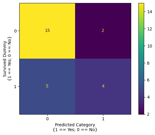
array([[15, 2],
[ 3, 6]])
We’re sure it’s clear as mud what the meaning of that output is!
scikit-learn functions and models are generally less “user-friendly” and informative (or verbose, depending on your opinion) that statsmodels functions/models.
Fortunately, we can make the meaning of the confusion matrix clearer, using the ConfusionMatrixDisplay() function:
# make a clearer display of the confusion matrix
from sklearn.metrics import ConfusionMatrixDisplay
ConfusionMatrixDisplay(confusion_matrix_2_predictors).plot()
plt.xlabel('Predicted Category\n{1 == Yes; 0 == No}')
plt.ylabel('Survived Dummy\n{1 == Yes; 0 == No}');
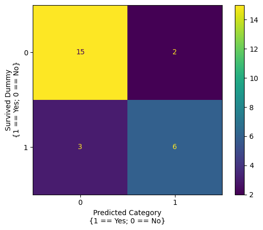
The confusion matrix summarizes how good the models predictions were.
The top left cell shows the number of true negative predictions - the passenger did not survive and the model predicted they did not. The top right cell shows the number of false positive predictions - the passenger did not survive, but the model predicted they did. The bottom left cell shows the number of false negative predictions - the passenger survived, but the model predicted they did not. The bottom right cell shows the number of true positive predictions - the passenger survived, and the model correctly predicted they did.
(Thinking about these can be a bit brain-bendy at first, so take a few moments to make sure you understand the matrix).
The confusion matrix can be indexed like a normal array, so let’s pull out the true positive count, false positive count, true negative count and false negative count as separate variables:
# get the counts
true_negative = confusion_matrix_2_predictors[0, 0]
false_positive = confusion_matrix_2_predictors[0, 1]
true_positive = confusion_matrix_2_predictors[1, 1]
false_negative = confusion_matrix_2_predictors[1, 0]
# get the total number of observations
total_n = true_positive + true_negative + false_positive + false_negative
# show the accuracy, computed from the confusion matrix
accuracy = (true_negative + true_positive)/total_n
accuracy
np.float64(0.8076923076923077)
Let’s compare the accuracy of the two prediction model, to that of the single predictor model:
# remind ourselves of the single predictor model
fitted_log_reg_mod_single_predictor.summary()
| Dep. Variable: | survived_dummy | No. Observations: | 26 |
|---|---|---|---|
| Model: | Logit | Df Residuals: | 24 |
| Method: | MLE | Df Model: | 1 |
| Date: | Tue, 03 Sep 2024 | Pseudo R-squ.: | 0.3104 |
| Time: | 10:06:18 | Log-Likelihood: | -11.565 |
| converged: | True | LL-Null: | -16.771 |
| Covariance Type: | nonrobust | LLR p-value: | 0.001252 |
| coef | std err | z | P>|z| | [0.025 | 0.975] | |
|---|---|---|---|---|---|---|
| Intercept | -2.5415 | 0.944 | -2.691 | 0.007 | -4.392 | -0.691 |
| fare | 0.0828 | 0.039 | 2.146 | 0.032 | 0.007 | 0.158 |
# generated `survived` predictions for the single predictor model
predictions_single_predictor = fitted_log_reg_mod_single_predictor.predict() > 0.5
predictions_single_predictor = predictions_single_predictor.astype('int')
predictions_single_predictor
array([0, 0, 0, 0, 0, 0, 0, 0, 0, 1, 0, 0, 0, 1, 1, 0, 0, 0, 1, 0, 0, 1,
0, 0, 1, 0])
# generate a confusion matrix from the single predictor model
confusion_matrix_1_predictor = confusion_matrix(sample_df['survived_dummy'], predictions_single_predictor)
ConfusionMatrixDisplay(confusion_matrix_1_predictor).plot()
plt.xlabel('Predicted Category\n{1 == Yes; 0 == No}')
plt.ylabel('Survived Dummy\n{1 == Yes; 0 == No}');
# calculate the accuracy from the single predictor model
(confusion_matrix_1_predictor[0, 0] + confusion_matrix_1_predictor[1, 1])/np.sum(confusion_matrix_1_predictor)
np.float64(0.7307692307692307)
Test/Train splits#
This accuracy (and other goodness-of-fit metrics) give us a way of comparing between models, like the two models we have compared here.
We would like our model to generate good predictions. However, typically we are interested in populations, and we must use samples to make inferences about those populations.
Another way of saying this is that we would like our model to generalize well when making predictions about unseen data from the same population.
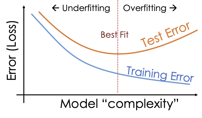
It might be tempting to think that more predictors included in the model equals better accuracy on the sample data equals better accuracy on unseen data.
However, it’s typically not a good idea to include too many predictors in a model. If a model is very complex (e.g. includes many predictors) it can lead to overfitting. Overfitting is where the model fits to noise in our particular sample which is not representative of the population from which the data came. This entails that the model will perform badly when making predictions about unseen data.
More often, simpler models will generalize better.
To avoid overfitting, we can use a test/train split. This involves splitting the data (for instance, we might use 80% of the data as a training set and 20% as a test set). We train/fit the model to the training data and then evaluate it against the test data. This allows us to simulate the process of evaluating the model against unseen data from the same population:

We then aim, through model comparison, to find the model that has the best “sweet spot” between complexity, and performance when predicting the unseen values in the test set:
We can create a test/train split manually, using indexing:
sample_df_train = sample_df.iloc[:20]
sample_df_test = sample_df.iloc[20:]
# show the training set
sample_df_train
| age | fare | survived | gender | survived_dummy | predicted_log_odds_of_survival | |
|---|---|---|---|---|---|---|
| 0 | 26.0 | 7.1711 | no | male | 0 | -2.871420 |
| 1 | 43.0 | 26.0000 | yes | female | 1 | 1.722766 |
| 2 | 24.0 | 8.0100 | no | male | 0 | -2.970319 |
| 3 | 42.0 | 7.1100 | no | male | 0 | -1.118678 |
| 4 | 30.0 | 13.0000 | no | male | 0 | -1.588213 |
| 5 | 22.0 | 7.1511 | no | male | 0 | -3.314706 |
| 6 | 19.0 | 8.0100 | no | male | 0 | -3.520812 |
| 7 | 25.0 | 13.0000 | no | male | 0 | -2.138706 |
| 8 | 32.0 | 15.1000 | no | female | 0 | -1.064372 |
| 9 | 50.0 | 65.0000 | yes | female | 1 | 8.132548 |
| 10 | 62.0 | 10.1000 | yes | male | 1 | 1.515624 |
| 11 | 21.0 | 7.1500 | no | female | 0 | -3.424964 |
| 12 | 26.0 | 7.1711 | no | male | 0 | -2.871420 |
| 13 | 34.0 | 81.1702 | yes | female | 1 | 8.709054 |
| 14 | 21.0 | 31.1000 | no | male | 0 | 0.038017 |
| 15 | 52.0 | 30.0000 | yes | female | 1 | 3.292022 |
| 16 | 19.0 | 26.0508 | yes | female | 1 | -0.912255 |
| 17 | 23.0 | 13.0000 | no | male | 0 | -2.358903 |
| 18 | 9.0 | 46.1800 | no | male | 0 | 0.897283 |
| 19 | 22.0 | 7.0406 | no | male | 0 | -3.330684 |
# show the test set
sample_df_test
| age | fare | survived | gender | survived_dummy | predicted_log_odds_of_survival | |
|---|---|---|---|---|---|---|
| 20 | 36.0 | 8.0100 | no | male | 0 | -1.649136 |
| 21 | 36.0 | 120.0000 | yes | male | 1 | 14.543734 |
| 22 | 5.0 | 27.1800 | no | male | 0 | -2.290361 |
| 23 | 17.0 | 7.1711 | no | male | 0 | -3.862307 |
| 24 | 1.0 | 39.0000 | yes | male | 1 | -1.021677 |
| 25 | 30.0 | 13.1702 | yes | female | 1 | -1.563603 |
However, scikit-learn contains useful functions that will create the split also:
from sklearn.model_selection import train_test_split
from sklearn.linear_model import LogisticRegression
from sklearn.metrics import accuracy_score
# separate out our predictors (X) from our outcome variable (Y)
X = sample_df[['fare', 'age']]
y = sample_df['survived_dummy']
# create the test/train split
X_train, X_test, y_train, y_test = train_test_split(X, y,
train_size=0.7)
jupyprint(f"Length of X_train: {len(X_train)}")
jupyprint(f"Length of X_test: {len(X_test)}")
jupyprint(f"Length of y_train: {len(y_train)}")
jupyprint(f"Length of y_test: {len(y_test)}")
# fit a logistic regression (using sklearn)
model = LogisticRegression().fit(X_train, y_train)
# evaluate the model on the test set, and show the accuracy
y_test_predictions = model.predict(X_test)
jupyprint(f"Accuracy on testing set: {accuracy_score(y_test, y_test_predictions)}")
Length of X_train: 18
Length of X_test: 8
Length of y_train: 18
Length of y_test: 8
Accuracy on testing set: 0.875
We can then repeat this process using the simpler model, and compare each models accuracy on the test data:
# modify the test data to include only one predictor
X_train_2 = X_train['fare']
X_test_2 = X_test['fare']
# fit a logistic regression to the training data
model = LogisticRegression().fit(X_train_2.values.reshape(-1, 1), y_train)
# evaluate the perform against the test data
y_test_predictions = model.predict(X_test_2.values.reshape(-1, 1))
accuracy_score(y_test, y_test_predictions)
0.75
Through using test/train splits, we can be more confident of the models performance with “unseen” data from the population - as we have simulated the process of testing it against it.
On the basis of this test/train split, it appears that adding much above the single predictor.
Cross-validation#
However, a disadvantage of the test/train split is that we have lost a portion of our data when fitting the model.
This can be an issue, especially where our sample is small. A better approach is to use cross-validation.
This is where we use a variety of different test/train splits on the same dataset. We fit our model to the multiple different test/train splits - where each subset of the data is used both as a training set and as a test (validation) set.
Here is an illustration, each block represents the whole sample, the white part is the training set, and the blue part is the test set.

Through fitting a model to each “fold” of the cross-validation (e.g. fitting the model to the training component, and then evaluating it against the test component, on each trial) we get a better estimate of how well the model will generalize to unseen data.
The code cell below performs the cross-validation:
from sklearn.model_selection import cross_val_score
# perform a cross validation for the two predictor model
survived_fare_age_cross_val = cross_val_score(LogisticRegression(),
sample_df[['fare', 'age']],
sample_df['survived_dummy'],
cv=5,
scoring='accuracy')
# show the cross validation result
survived_fare_age_cross_val
array([1. , 1. , 0.8, 0.6, 0.6])
Each element in the array shows the accuracy score for the two predictor model fit to a specific test/train split.
We can take the mean accuracy to get a good estimate of well the model would predict unseen data.
np.mean(survived_fare_age_cross_val)
np.float64(0.8)
We can then compare this to the single predictor model:
# cross-validation using the single predictor model
survived_fare_cross_val = cross_val_score(LogisticRegression(),
sample_df['fare'].values.reshape(-1, 1),
sample_df['survived_dummy'],
cv=5,
scoring='accuracy')
survived_fare_cross_val
array([0.83333333, 0.8 , 0.6 , 0.8 , 0.8 ])
np.mean(survived_fare_cross_val)
np.float64(0.7666666666666666)
The two predictor model has better accuracy over the different test/train splits.
Let’s set up a loop to compare the accuracy of various models:
# add a dummy for gender
df = sample_df
df['gender_dummy'] = df['gender'].replace(['male', 'female'], [0, 1])
# different combinations of predictors
model_1_predictors = ['fare']
model_2_predictors = ['fare', 'age']
model_3_predictors = ['fare', 'age', 'gender_dummy']
model_list = [model_1_predictors, model_2_predictors, model_3_predictors ]
# separate out predictors from the outcome variable
X = df[['fare', 'age', 'gender_dummy']]
y = df['survived_dummy']
# loop over the different combinations of predictors, and get cross-validated
# accuracy scores for them
results_df = pd.DataFrame()
for model in model_list:
X_current_model = X[model].values
jupyprint(f'==== Model: survived ~ {" + ".join(model)}')
current_model_cross_val_score = cross_val_score(LogisticRegression(),
X_current_model,
y,
cv=5,
scoring='accuracy').mean()
jupyprint(f'Accuracy = {current_model_cross_val_score}')
results_df[' + '.join(model)] = [current_model_cross_val_score]
# show the results
results_df.T
/tmp/ipykernel_3548/3897424400.py:3: FutureWarning:
Downcasting behavior in `replace` is deprecated and will be removed in a future version. To retain the old behavior, explicitly call `result.infer_objects(copy=False)`. To opt-in to the future behavior, set `pd.set_option('future.no_silent_downcasting', True)`
==== Model: survived ~ fare
Accuracy = 0.7666666666666666
==== Model: survived ~ fare + age
Accuracy = 0.8
==== Model: survived ~ fare + age + gender_dummy
Accuracy = 0.76
| 0 | |
|---|---|
| fare | 0.766667 |
| fare + age | 0.800000 |
| fare + age + gender_dummy | 0.760000 |
Because of the cross-validation, we can be more confident that each models mean accuracy score reflects how it will generalize to unseen data.
We can also use this procedure for different types of model.
The cell below allows for comparison between the logistic regression model, and a naive Bayes classifier:
from sklearn.naive_bayes import GaussianNB
# loop using a Naive bayes classifier
results_df = pd.DataFrame()
for model in model_list:
X_current_model = X[model].values
jupyprint('== Naive Bayes Classifier')
jupyprint(f'==== Model: survived ~ {" + ".join(model)}')
current_model_cross_val_score = cross_val_score(GaussianNB(),
X_current_model,
y,
cv=5,
scoring='accuracy').mean()
jupyprint(f'Accuracy = {current_model_cross_val_score}')
results_df[' + '.join(model)] = [current_model_cross_val_score]
results_df.T
== Naive Bayes Classifier
==== Model: survived ~ fare
Accuracy = 0.7666666666666668
== Naive Bayes Classifier
==== Model: survived ~ fare + age
Accuracy = 0.8466666666666667
== Naive Bayes Classifier
==== Model: survived ~ fare + age + gender_dummy
Accuracy = 0.8
| 0 | |
|---|---|
| fare | 0.766667 |
| fare + age | 0.846667 |
| fare + age + gender_dummy | 0.800000 |
Other ways of model-building#
A different method of model building involves the Akaike Information Criterion:
\( \text{AIC} = 2k-2\ln({\hat {L}}) \)
This metric:
Penalizes complexity (more predictors), rewards parsimony - getting good fit with lower number of predictors
Works with linear regression too! - look at statsmodels output
Lower (or more negative) AIC is better
# a function to calculate AIC
def aic(number_of_parameters, log_likelihood):
return 2*number_of_parameters - 2*log_likelihood
# a visualisation of AIC, as a function of model fit (log-likelihood, and complexity)
num_params = np.linspace(1, 10)
log_likelihood = np.linspace(-100, 100)
num_params, log_likelihood = np.meshgrid(num_params, log_likelihood)
y = aic(num_params, log_likelihood)
fig = go.Figure()
fig.add_trace(go.Surface(x=num_params, y=log_likelihood, z=y)).update_layout(scene=dict(
xaxis_title="Number of Parameters", yaxis_title="Log-Likelihood", zaxis_title='AIC'))
# show the model with two predictors
fitted_log_reg_mod.summary()
| Dep. Variable: | survived_dummy | No. Observations: | 26 |
|---|---|---|---|
| Model: | Logit | Df Residuals: | 23 |
| Method: | MLE | Df Model: | 2 |
| Date: | Tue, 03 Sep 2024 | Pseudo R-squ.: | 0.5089 |
| Time: | 10:06:18 | Log-Likelihood: | -8.2360 |
| converged: | True | LL-Null: | -16.771 |
| Covariance Type: | nonrobust | LLR p-value: | 0.0001965 |
| coef | std err | z | P>|z| | [0.025 | 0.975] | |
|---|---|---|---|---|---|---|
| Intercept | -6.7709 | 2.602 | -2.602 | 0.009 | -11.871 | -1.671 |
| fare | 0.1446 | 0.065 | 2.223 | 0.026 | 0.017 | 0.272 |
| age | 0.1101 | 0.055 | 2.009 | 0.045 | 0.003 | 0.218 |
# the AIC from the model with two predictors
fitted_log_reg_mod.aic
np.float64(22.47203433679345)
# show the model parameters
fitted_log_reg_mod.params
Intercept -6.770868
fare 0.144592
age 0.110099
dtype: float64
# show the model log-likelihood
fitted_log_reg_mod.llf
np.float64(-8.236017168396724)
# recalculate the AIC, manually
aic(len(fitted_log_reg_mod.params), fitted_log_reg_mod.llf)
np.float64(22.47203433679345)
# show the single predictor model
fitted_log_reg_mod_single_predictor.summary()
| Dep. Variable: | survived_dummy | No. Observations: | 26 |
|---|---|---|---|
| Model: | Logit | Df Residuals: | 24 |
| Method: | MLE | Df Model: | 1 |
| Date: | Tue, 03 Sep 2024 | Pseudo R-squ.: | 0.3104 |
| Time: | 10:06:18 | Log-Likelihood: | -11.565 |
| converged: | True | LL-Null: | -16.771 |
| Covariance Type: | nonrobust | LLR p-value: | 0.001252 |
| coef | std err | z | P>|z| | [0.025 | 0.975] | |
|---|---|---|---|---|---|---|
| Intercept | -2.5415 | 0.944 | -2.691 | 0.007 | -4.392 | -0.691 |
| fare | 0.0828 | 0.039 | 2.146 | 0.032 | 0.007 | 0.158 |
# show the AIC of the single predictor model (compare this to that of the two predictor model - lower is better!)
fitted_log_reg_mod_single_predictor.aic
np.float64(27.13041810470826)