Kernel density estimation#
import numpy as np
import pandas as pd
import scipy.stats as sps
import matplotlib.pyplot as plt
pd.set_option('mode.copy_on_write', True)
import seaborn as sns
Also see: Kernel density estimation in the Python Data Science Handbook.
Let us go back to the Penguin dataset:
penguins = pd.read_csv('data/penguins.csv').dropna()
penguins
| species | island | bill_length_mm | bill_depth_mm | flipper_length_mm | body_mass_g | sex | year | |
|---|---|---|---|---|---|---|---|---|
| 0 | Adelie | Torgersen | 39.1 | 18.7 | 181.0 | 3750.0 | male | 2007 |
| 1 | Adelie | Torgersen | 39.5 | 17.4 | 186.0 | 3800.0 | female | 2007 |
| 2 | Adelie | Torgersen | 40.3 | 18.0 | 195.0 | 3250.0 | female | 2007 |
| 4 | Adelie | Torgersen | 36.7 | 19.3 | 193.0 | 3450.0 | female | 2007 |
| 5 | Adelie | Torgersen | 39.3 | 20.6 | 190.0 | 3650.0 | male | 2007 |
| ... | ... | ... | ... | ... | ... | ... | ... | ... |
| 339 | Chinstrap | Dream | 55.8 | 19.8 | 207.0 | 4000.0 | male | 2009 |
| 340 | Chinstrap | Dream | 43.5 | 18.1 | 202.0 | 3400.0 | female | 2009 |
| 341 | Chinstrap | Dream | 49.6 | 18.2 | 193.0 | 3775.0 | male | 2009 |
| 342 | Chinstrap | Dream | 50.8 | 19.0 | 210.0 | 4100.0 | male | 2009 |
| 343 | Chinstrap | Dream | 50.2 | 18.7 | 198.0 | 3775.0 | female | 2009 |
333 rows × 8 columns
In fact, let’s imagine we’re getting ready to do some prediction task, so we’ve split the data into a test and train set.
from sklearn.model_selection import train_test_split

X_train, X_test, y_train, y_test = train_test_split(
    penguins[['bill_depth_mm']],
    penguins['species'])
X_train
| bill_depth_mm | |
|---|---|
| 98 | 16.1 |
| 203 | 14.1 |
| 286 | 17.8 |
| 192 | 13.7 |
| 199 | 15.9 |
| ... | ... |
| 127 | 18.3 |
| 294 | 18.6 |
| 188 | 13.7 |
| 285 | 19.9 |
| 14 | 21.1 |
249 rows × 1 columns
For the moment, we’re only going to look at the Chinstrap penguins.
# Select the Chinstrap penguins from the training set.
chinstrap_train = X_train[y_train == 'Chinstrap']
chinstrap_train
| bill_depth_mm | |
|---|---|
| 286 | 17.8 |
| 341 | 18.2 |
| 322 | 17.9 |
| 312 | 18.3 |
| 303 | 19.0 |
| 280 | 19.8 |
| 276 | 17.9 |
| 284 | 18.9 |
| 328 | 17.3 |
| 298 | 16.6 |
| 283 | 18.2 |
| 281 | 17.8 |
| 305 | 20.0 |
| 277 | 19.5 |
| 337 | 16.5 |
| 282 | 18.2 |
| 291 | 19.6 |
| 335 | 19.4 |
| 296 | 17.3 |
| 317 | 17.5 |
| 336 | 19.5 |
| 338 | 17.0 |
| 323 | 19.6 |
| 316 | 19.5 |
| 299 | 19.4 |
| 334 | 18.8 |
| 313 | 20.7 |
| 330 | 17.3 |
| 329 | 19.7 |
| 326 | 16.4 |
| 314 | 16.6 |
| 300 | 17.9 |
| 320 | 17.9 |
| 332 | 16.6 |
| 293 | 17.8 |
| 292 | 20.0 |
| 333 | 19.9 |
| 311 | 16.8 |
| 340 | 18.1 |
| 339 | 19.8 |
| 331 | 18.8 |
| 287 | 20.3 |
| 327 | 19.0 |
| 307 | 20.8 |
| 306 | 16.6 |
| 321 | 18.5 |
| 294 | 18.6 |
| 285 | 19.9 |
len(chinstrap_train)
48
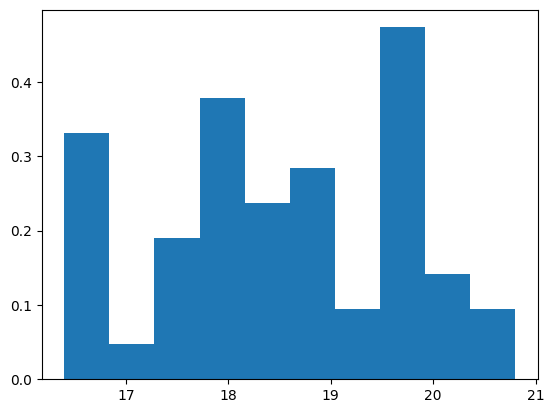
We’re particularly interested in the histogram of the bill depth. We’ll use the density version of the histogram, normalized to a bar area of 1:
bill_depth = chinstrap_train['bill_depth_mm']
plt.hist(bill_depth, density=True);
We can also mark where the actual points fall on the x-axis, like this:
plt.hist(bill_depth, density=True);
tick_y = np.zeros(len(bill_depth)) - 0.01
# Black marks at the actual values.
plt.plot(bill_depth, tick_y, '|k', markeredgewidth=1);
plt.title('Density histogram with 10 bins, point markers');
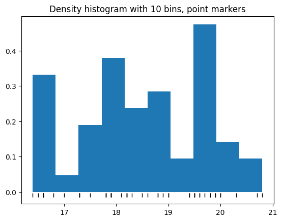
Notice this histogram is rather blocky. We could try increasing the number of bins, but we’ve only got 51 rows to play with:
plt.hist(chinstrap_train, bins=20, density=True);
# Black marks at the actual values.
plt.plot(bill_depth, tick_y, '|k', markeredgewidth=1);
plt.title('Density histogram with 20 bins');
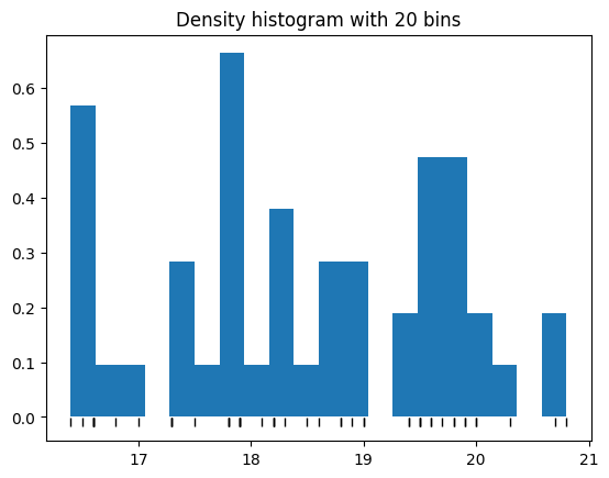
Oops - that’s even worse. We can see that small variations in the weights are going to push the blocks back and forth, changing our estimate of the densities.
We’d like some estimate of what this density histogram would look like if we had a lot more data.
This estimate is called a kernel density estimate.
We are going to blur the histogram by replacing the points that stack up into the bars, by little normal distributions. Let’s give these normal distributions a standard deviation of (arbitrarily) 0.25.
dist_sd = 0.25
First consider the maximum point:
bd_max = np.max(bill_depth)
bd_max
np.float64(20.8)
We’ll make a little normal distribution centered on that point:
# Distribution with mean bd_max, standard deviaion dist_d
max_nd = sps.norm(bd_max, dist_sd)
# x axis values for which to calculate y-axis values.
nd_x = np.linspace(
    bill_depth.min() - 4 * dist_sd,
    bill_depth.max() + 4 * dist_sd,
    1000
)
We can plot that on the same plot as before.
# Black marks at the actual values.
plt.plot(bill_depth, tick_y, '|k', markeredgewidth=1);
plt.fill_between(nd_x, max_nd.pdf(nd_x), alpha=0.5, color='r')
plt.title('Gaussian corresponding to maximum value');
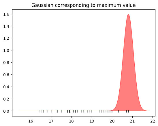
Here we’ve replaced the single point (the maximum) with a spread-out version of that point.
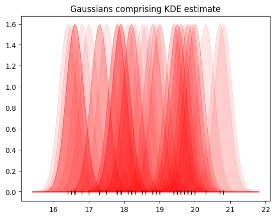
Now let’s do the same for all the points.
# Black marks at the actual values.
plt.plot(bill_depth, tick_y, '|k', markeredgewidth=1);
# A normal distribution for each point
values = np.array(chinstrap_train)
for point in values:
    dist_for_pt = sps.norm(point, dist_sd)
    plt.fill_between(nd_x, dist_for_pt.pdf(nd_x), alpha=0.1,
                     color='r')
plt.title('Gaussians comprising KDE estimate');
Finally, add up all these normal distributions:
y_values = np.zeros(len(nd_x))
for point in bill_depth:
    dist_for_pt = sps.norm(point, dist_sd)
    y_values += dist_for_pt.pdf(nd_x)
This is the shape of our kernel density estimate - we still need to get the y-axis scaling right, but a few cells down.
plt.fill_between(nd_x, y_values, alpha=0.5, color='r');
plt.title('KDE before normalizing area to 1');
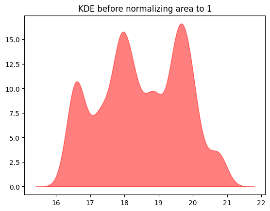
Finally, divide this curve by the area under the curve to get the kernel density estimate.
# The gap between the x values
delta_x = np.diff(nd_x)[0]
# Divide by sum and by gap
kde_y = y_values / np.sum(y_values) / delta_x
plt.hist(chinstrap_train, bins=20, density=True);
# Black marks at the actual values.
plt.plot(bill_depth, tick_y, '|k', markeredgewidth=1);
# Show the kernel density estimate
plt.fill_between(nd_x, kde_y, alpha=0.5, color='r')
plt.title('KDE and raw density histogram');
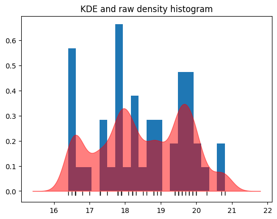
This is our kernel density estimate.
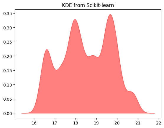
We get the same estimate from Scikit-learn.
from sklearn.neighbors import KernelDensity

# instantiate and fit the KDE model
skl_kde = KernelDensity(bandwidth=dist_sd, kernel='gaussian')
skl_kde.fit(values)

# score_samples returns the log of the probability density.
logprob = skl_kde.score_samples(nd_x[:, None])
# Convert to probability density.
skl_kde_y = np.exp(logprob)

# This gives the same plot as our original calculation.
assert np.allclose(kde_y, skl_kde_y)  # Values the same.
plt.fill_between(nd_x, np.exp(logprob), alpha=0.5, color='r');
plt.title('KDE from Scikit-learn');